

PV Panel Viewer
UX/UI Design
Client:
Wesii
Industry:
B2B SaaS, Renewable Energy
Scope:
Full redesign - UX audit, component exploration, high fidelity mockups
Project overview:
Analysis and redesign of the old PV Panel Viewer to make it an actual working tool, instead of being just a static and mostly useless viewer inside the Wesii Web Portal.
This project is covered by NDA. Details are intentionally kept broad and visuals are selected excerpts from the final deliverables.
What is the Panel Viewer?
Wesii surveys photovoltaic plants using drones and aerial thermography to identify anomalies in solar panels before they become expensive problems. The results of each inspection are uploaded to a Web Portal, where clients and Operations & Maintenance teams can review orthomosaics, images and interactive data layers of their plants.
When an anomaly is detected on a specific panel, clicking on it opens the Panel Viewer, a dedicated interface for understanding the issue in detail and deciding what to do next.
That’s the theory. In practice, the tool that existed before this redesign made all of that significantly harder than it needed to be. Most of the time it felt even useless.
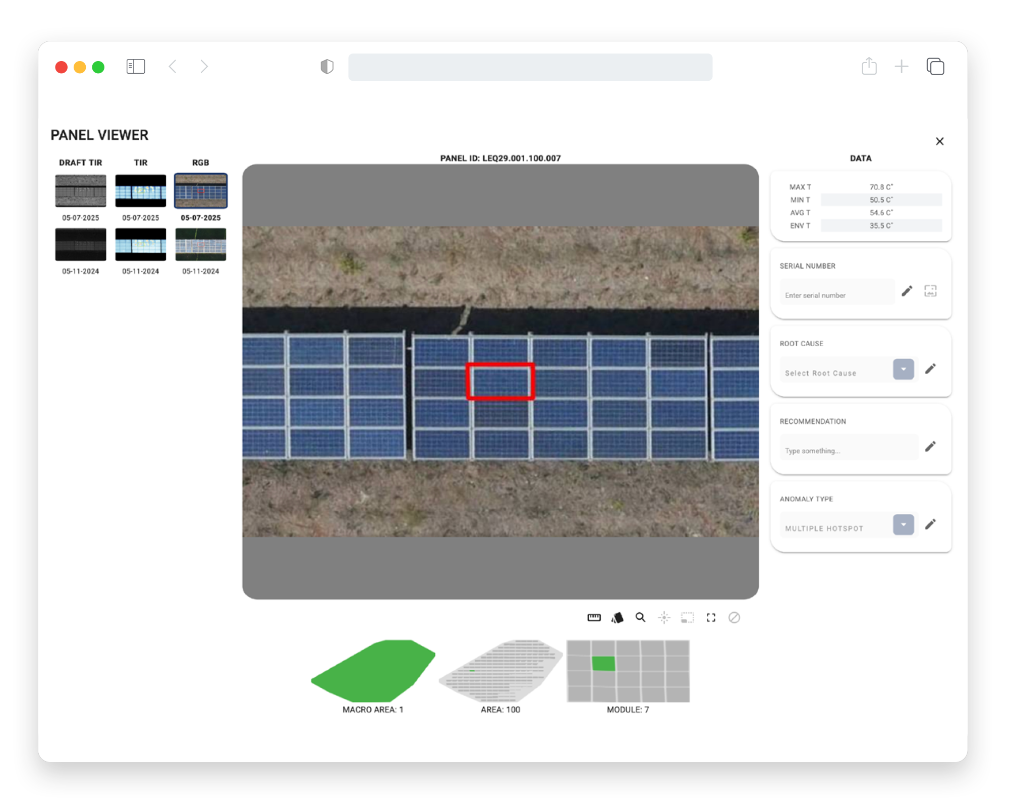
Old Panel Viewer, hanging there for a dear life.
The problem
The original Panel Viewer has been built without any concern about usability and the end goal. The result was an interface where data, images, actions and navigation competed for attention at the same visual level. Toolbar icons were unlabelled, the data panel read like a form rather than a workspace, and there was no clear hierarchy.
It was confusing and hard to understand what’s the real scope and potential of this tool. It was also blatantly clear that almost no user was using it.
The brief was clear: fix it. The timeline was less so: 48 hours.
Reframing the tool
Before touching a single component, the most important decision was rather conceptual: what should the Panel Viewer actually be?
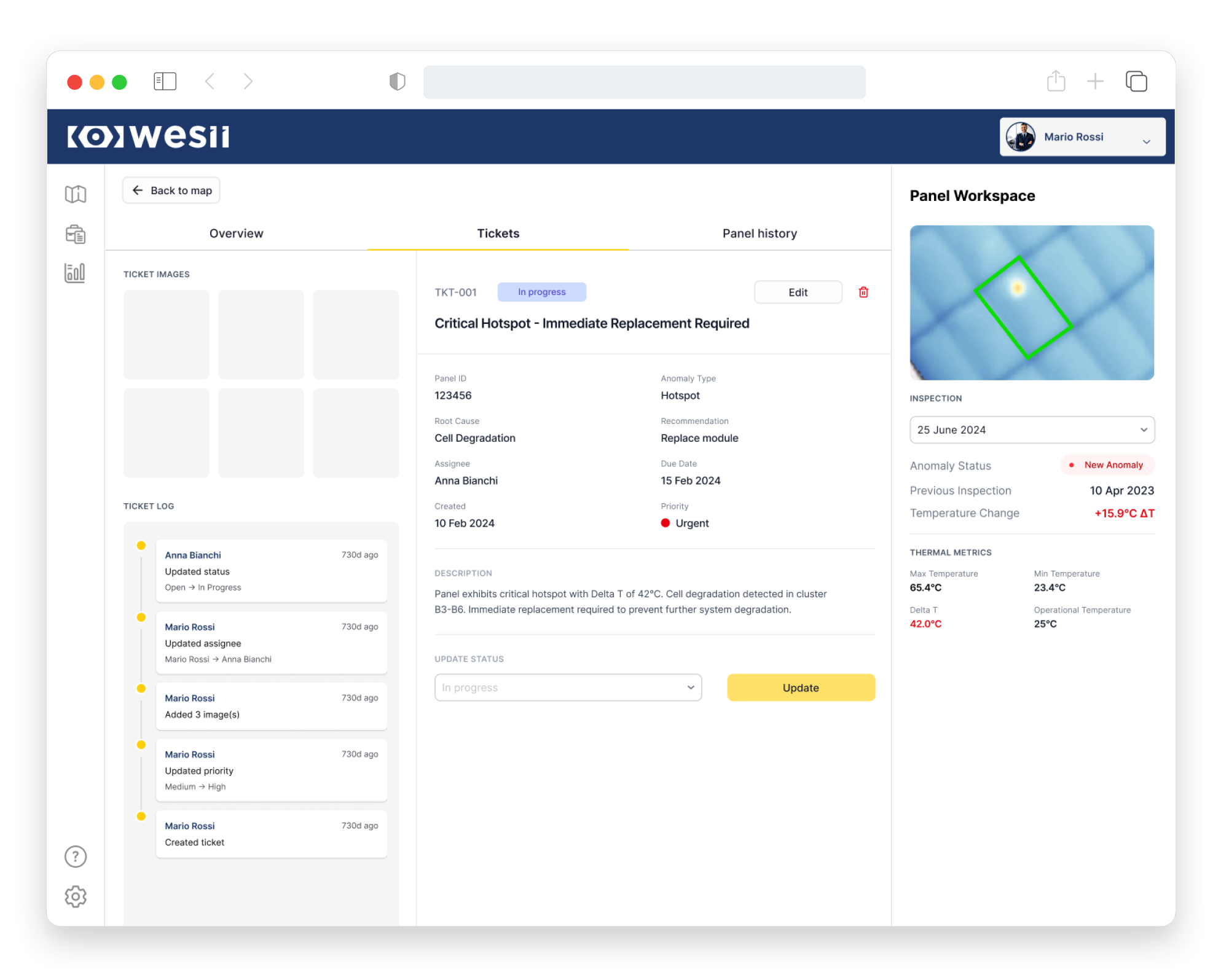
First of all, it needed to stop being a viewer and start being a workspace. In this case, the distinction matters more than it might seem. A viewer presents information passively, while a workspace enables actual action. And for O&M teams who needed to assess anomalies, create tickets, log actions and track changes, passive presentation wasn’t enough.
Solution
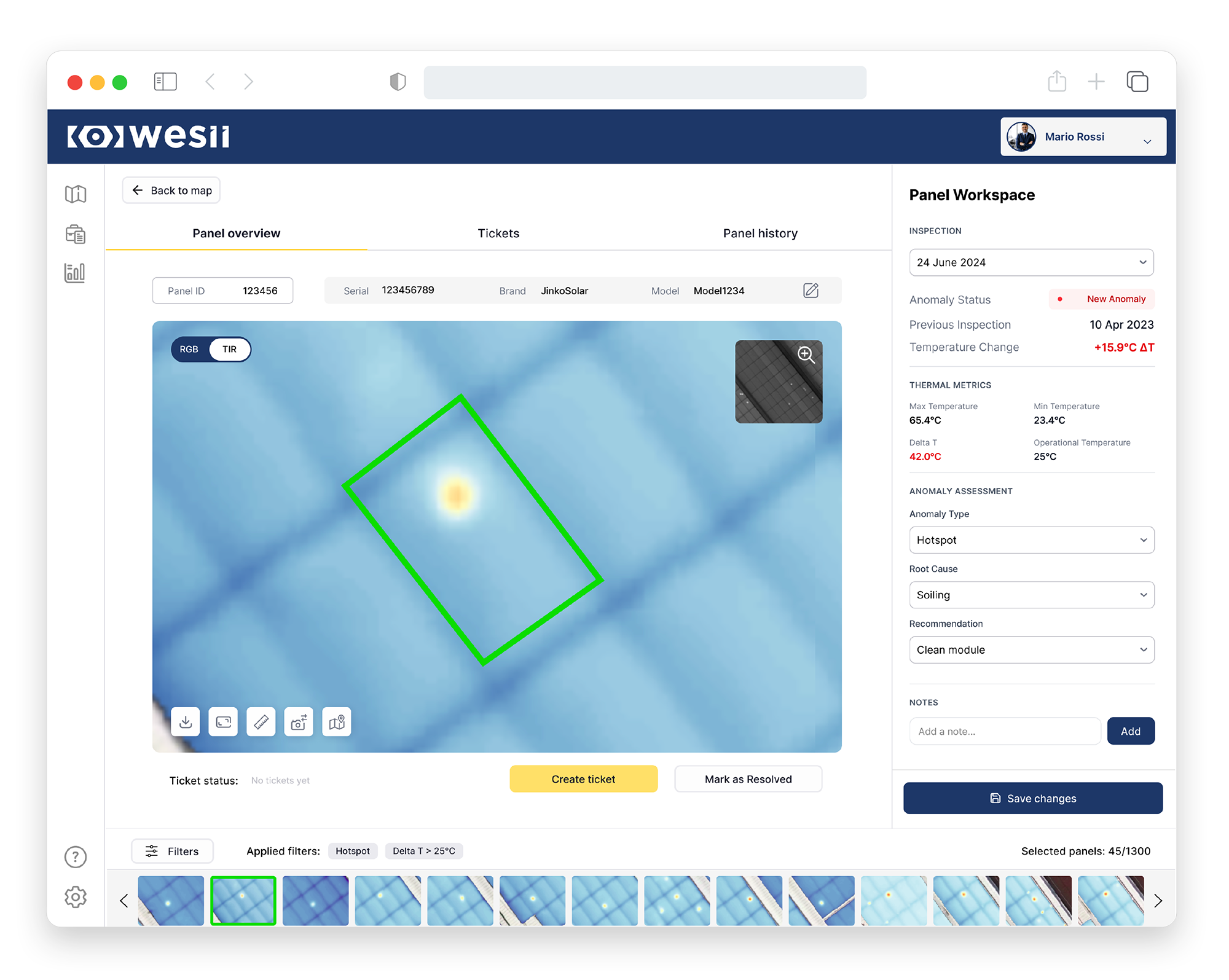
The redesign restructured the Panel Viewer around two main staples:
→ Structure
A tabbed navigation system replaced the original’s flat, everything-at-once layout. Now we have three main tabs that immediately categorises the content and direct users towards the desired action.
→ Clarity
The right panel was revamped and reorganised into clearly labelled sections: Inspection, Thermal Metrics, Anomaly Assessment, Notes. Critical information, such as anomaly status and temperature delta, is colour-coded and immediately visible. The interface tells you what matters before you can say “I don’t know where it is”.
The gallery - The tricky one
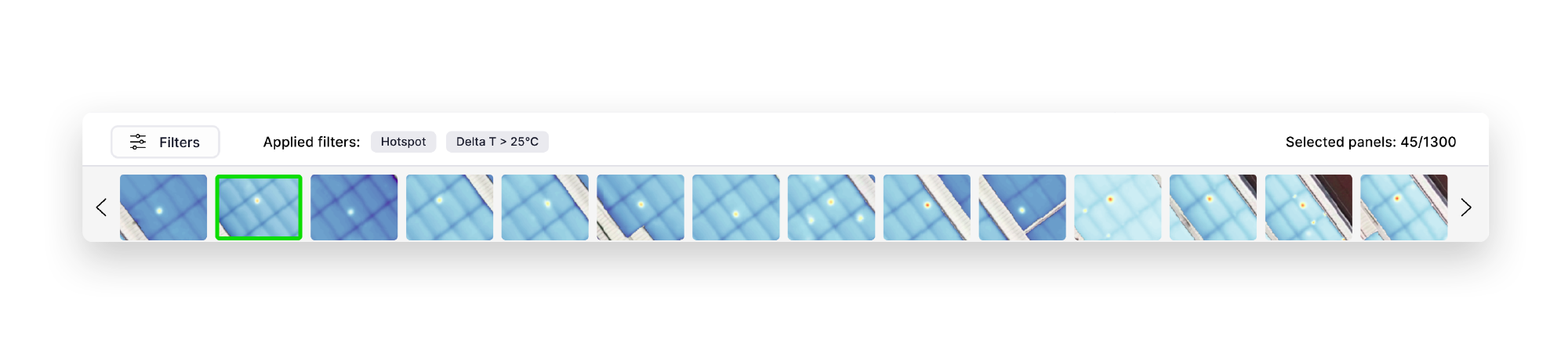
One of the core requirements was transforming the Panel Viewer from a read-only tool into an active work environment. Central to that was adding a panel gallery, a way for O&M workers to navigate between panels within their current filtered view without going back to map every time.
I’ll be honest… I was not convinced.
A gallery of panel thumbnails gives you a constrained visual context and not an actual spatial context within a plant. For an O&M professional working across a large plant with thousands of panels - each following Wesii’s internal numbering system, mind you - knowing which panel you’re looking at could be not enough. Without map integration immediately available within the same interface, there’s a real risk of creating tickets, logging actions, or making decisions in the wrong area of the plant, especially if the plant is big and maintenance operations are scheduled by area or group of inverters.
The filtering system provides a partial answer. It narrows the gallery to specific anomaly types or temperature thresholds, but it’s a workaround. The spatial orientation problem is an open design question that I ran out of time to solve properly before the deadline.
The filmstrip gallery at the bottom of the redesign is inspired by the workspace model of Adobe Lightroom and it was the best available solution within the constraints of 48 hours. It could work better and if I were to iterate on this project, map integration would be the first place I’d go.
What got cut
Not everything from the original Panel Viewer made it into the redesign.
Two features were evaluated as obsolete and removed entirely.
The historical image navigation (a collection of past inspection thumbnails) was adding visual noise without adding diagnostic value. When you’re assessing the current inspection, an archive of previous images is an optional nice-to-have, not a real resource for the present-day maintenance.
The Macro Area / Area / Module location system met the same fate. In theory, a hierarchical location reference sounds useful, but visually it was unreadable, and more critically it followed Wesii’s internal numbering logic rather than the client’s own As-Built or electrical layout.
In the end, knowing what to remove is as important as knowing what to add and this is exactly what I did here.
48 hours
Sounds almost like that awfully rated movie from 2019, but it’s worth mentioning that this project was a sprint. There was no time for traditional wire-framing and the entire process was rapid and iterative, working directly with components and making quick decisions.
Working largely independently, without the support structure a project of this complexity arguably deserved, the redesign was delivered on time and handed off for implementation.
What I would do differently next time
The gallery. Always the gallery.
Given more time, I would have pushed for a map-integrated navigation solution that kept users spatially oriented within the plant while moving between panels. The filmstrip works as a starting point, but the real solution stands in a hybrid solution that revolutionises the entire inspection interface and its navigation.
On this note, I’d also advocate earlier and louder for a proper company design system. Building a coherent interface from scratch in 48 hours is one thing. Building it in a way that scales, integrates with existing portal components, and can be maintained by whoever comes next… well, that requires a foundation that didn’t exist. The redesign is solid, don’t get me wrong, but working with a curated design system would have put it on another level.
Finally, I’d push back on the timeline. 48 hours and no feedback on the old Panel Viewer from the clients to begin with set an important constraint in terms of focus and complexity of the output. Some of you may argue that nowadays we should be able to deliver insane interfaces in the matter of hours, but here you will always find me raising my hand and telling you that I don’t necessarily agree with you. Good design takes time.