

Personal Branding
Brand Design
Client:
Self-commissioned
Industry:
Art & Design
Scope:
Brand strategy and positioning, visual identity, website, print and digital applications
Project overview:
There is a particular kind of challenge that comes with being your own client. No one to push back on your decisions, no external deadline, and a very real risk of ending up with something that looks like a designer tried too hard (or not hard enough).
What I did here is exactly what I would do with any other client: I gave myself a proper brief, asked the uncomfortable questions, tried to be realistic, and refused to open any Adobe software until I had some answers.
This is (kind of a) short story of how I built a brand identity for the most demanding and indecisive client I have ever worked with: myself.
NB. This is still an ongoing project, but I would love to share the thinking behind the work already done and the work that is still in the pipeline.

Moodboard • Image source: Pinterest, Unsplash
The problem
Two problems, actually. And they were tangled together in a slightly inconvenient way.
The first was practical: I had no coherent personal brand. Twelve years of work, a clear philosophy, a recognisable visual sensibility, many things to say and to share… and nothing that pulled it all together into a system that could represent me in a consistent way. Website? Non existent. Business card? Which one? The social media presence? The profiles I deleted multiple times, you say? Don’t make me even mention assets like logo which I changed at least four times in the past ten years.
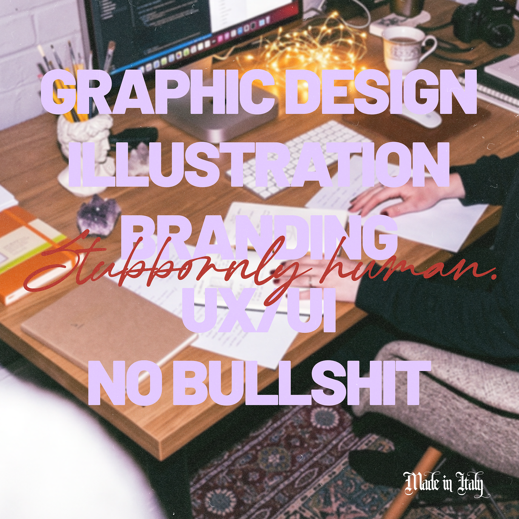
The second problem was strategic: how do you present a multidisciplinary designer practice without looking like a generalist? Graphic Design, Illustration, Branding, UX/UI - four disciplines that are genuinely connected in my practice, but with a risk of reading them as scattered to someone that doesn’t know me yet.
In the words of tired millennials: the struggle was real.
Hypothesis
If the visual identity is distinctive enough and the strategic positioning is clear enough, then working across disciplines becomes a strength. The hypothesis was simple: build a brand with a strong enough point of view, so the range becomes part of the story, not a footnote of it.
The second hypothesis was about the mark and visual representation of the brand. Instead of creating complex logo to tie multiple disciplines together, I opted for anchoring the identity to a single graphic element, strong enough to stand alone. Everything else would orbit around it and be easily tied to different disciplines that I usually work in.
The process
The process started not with the visuals but with questions. Who am I designing for? What do I want them to feel when they bump into this brand? How do I want my visuals to look like? Do I want to look more corporate or human? The questions were obviously multiple, but once I wrote down the answers, then came the positioning.
I wanted to keep the range as a feature, highlight the human-to-human philosophy, and cherish my strong point of view and opinions, rather than copying everybody else’s bland approach. The sassy character was also a strong point to consider since I don’t want to hide behind fake personas or pretend to be someone that I am not.
Setting a tone of voice was very important in this case and it has been curated around three macro definitions:
Witty but Professional
There is always a room for well-placed observation or a line that makes someone smile, but never at the expense of clarity or credibility. The wit is a bit dry and it has to earn its place.
Bold and Human
The brand has opinions and it’s not afraid to express them. No arrogance, though, just honesty and transparency. You will never see me writing sentences like “Leveraging innovative design solutions to maximise brand impact”. I’ve got an instant puke reflex just by quoting that phrase, oh boy.
Approachable
Jargon-free voice that makes potential clients feel like they are talking to a person, not reading an AI generated brochure.
Solution
Strategically, the brand was positioned around a human-to-human philosophy: the conviction that good design starts with listening, and that a designer who works across different disciplines (still narrowed down, because remember… the master of everything is the master of none!) has more ears to listen with and more hands to offer different tailored solutions. All of this and the fact that the brand doesn’t rely on souless AI became the focal point. The open aversion towards fully AI-generated output is not nostalgia. It’s actually a core value and a strategic differentiator that is set in human creativity and human connection.
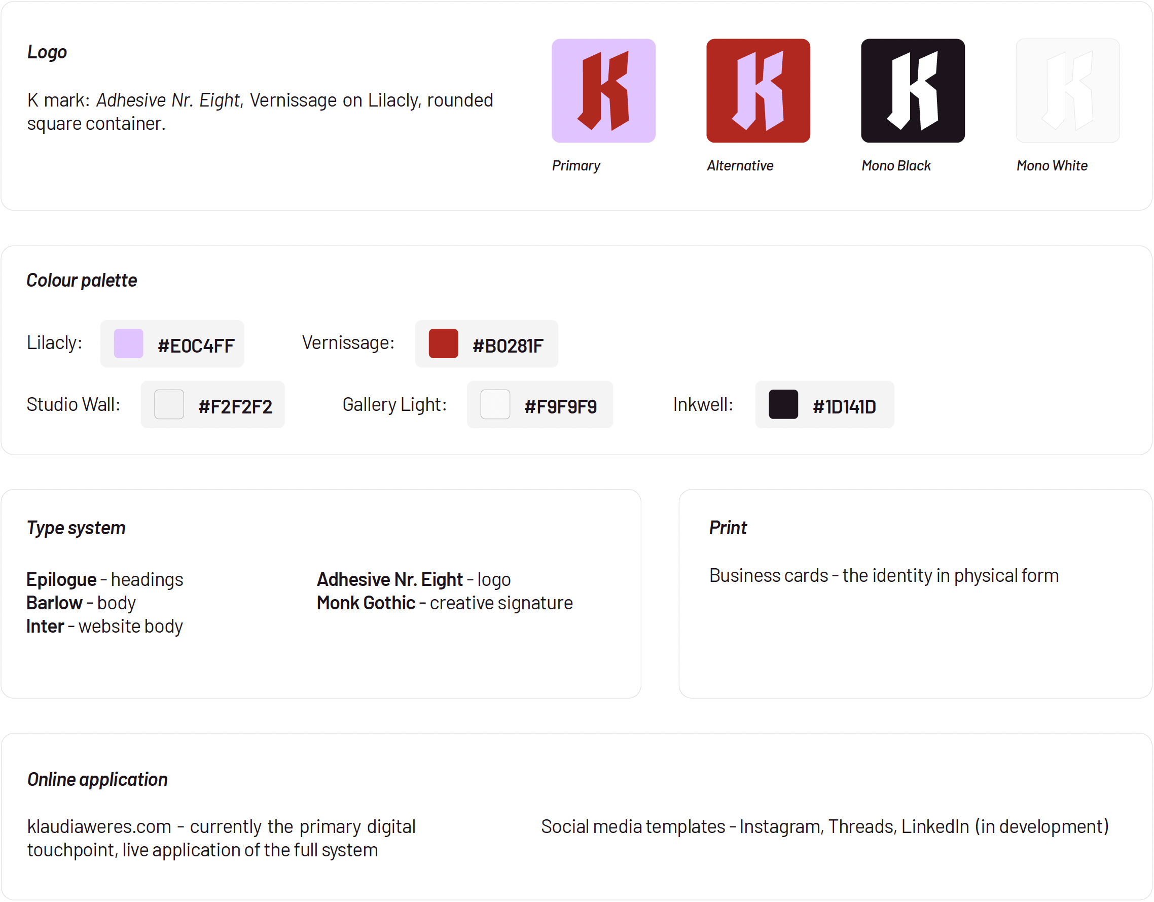
Visually, the identity was built around the K mark, a bold monogram in Adhesive Nr. Eight, set in Vernissage red on a Lilacly background, contained within a rounded square. Immediate and ownable, was inspired by designers like Stefan Sagmeister, whose identity is anchored by a single initial that travels unchanged while everything around it adapts.
The choice between Monk and Adhesive Nr. Eight for the K was settled by legibility. Adhesive rendered the letter more clear and clean at logo scale, with no sacrifice to the gothic character that was one of the main requests for the entire identity.
The colour palette - Vernissage and Lilacly as primaries, Studio Wall, Gallery Light, and Inkwell as supporting neutrals - was chosen to hold the same tension as the brand itself. The colour palette went through several combinations before the chosen one settled into place. I went through blacks, acidic greens, different shades of red, but in the end the lilac and deep red won. I’m actually pretty obsessed with this combination and I feel like this is exactly how you should feel about your own visuals.
Typography follows a clear system: Epilogue for display and major headings through both web and print. Barlow as the workhorse for body copy and supporting text. Inter for web body copy - this switch was intentional; after careful analysis, Inter proved to be more balanced for display. Last but not least, we have Monk that is reserved as a creative signature.

Outlook
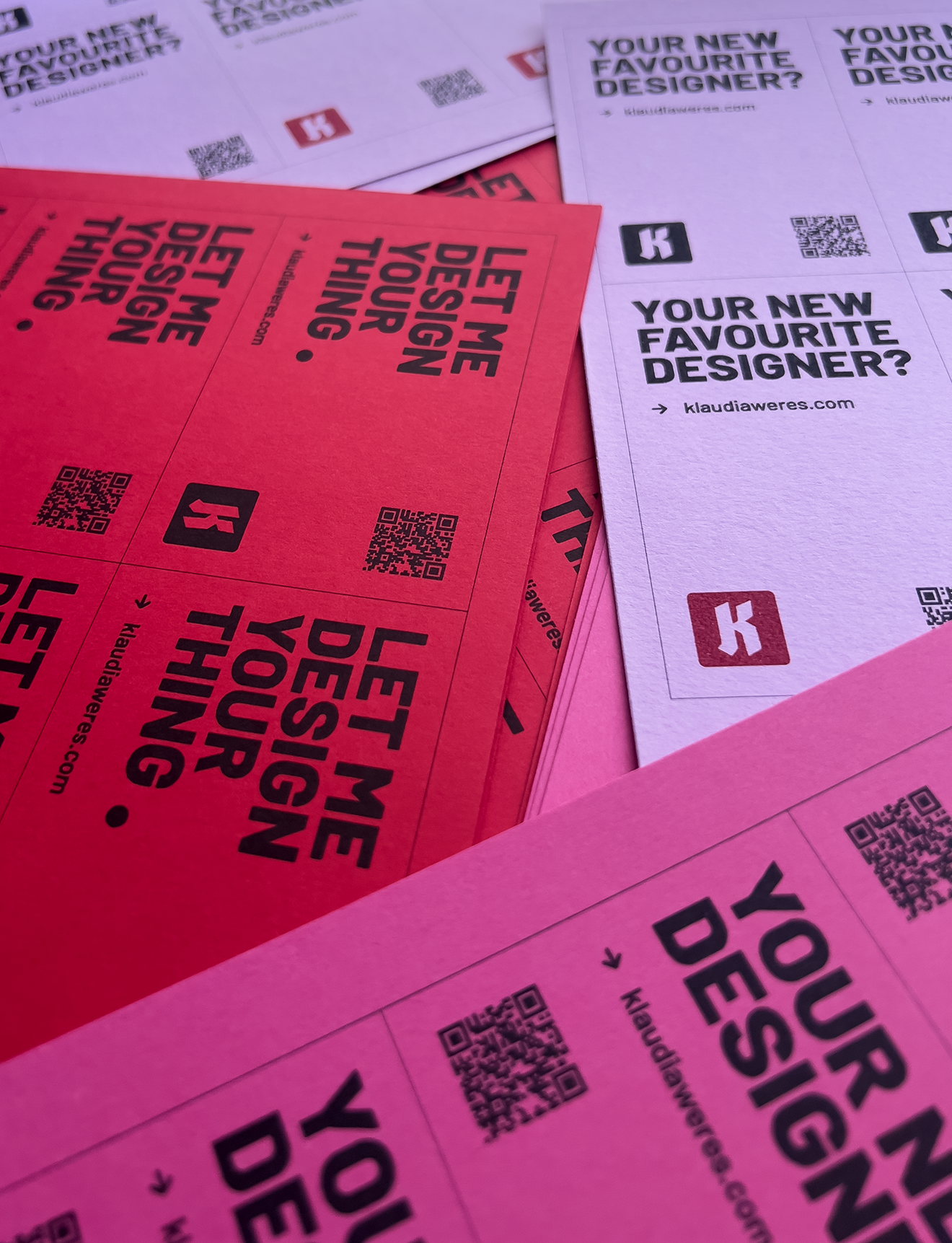
This brand is live, but not finished. A brand system is only complete when it has been tested across enough contexts to prove it holds together, and that there is still ground to cover.
In the end it’s not just the matter of creating a scalable logo or choosing a balanced palette. The governance and periodical updates and expansion also play a big role. Showing up is also very important, even more than a nice mark.
The immediate next step, in fact, is social media: Instagram, Threads, and LinkedIn, with a suite of content templates that extend the visual system into a community-facing context. The goal here is connection. A space for designers, potential clients and art & design enthusiasts to gather around shared interests, processes, honest conversations, etc.
Beyond that, more print materials and content are set down the pipeline.