

My Argo
Brand Identity
Packaging
Client:
-
Industry:
Pet Food & Per Care - Organic dog nutrition
Scope:
Full brand identity - naming, logotype, visual identity system, packaging design (dry kibble, wet food, treats), brand application
Project overview:
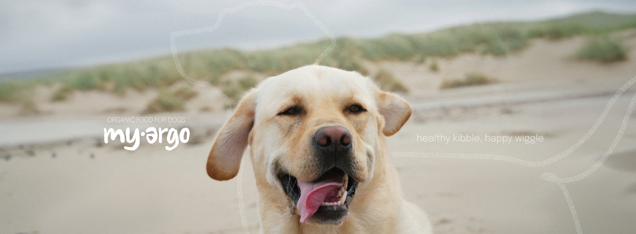
My Argo is an organic dog food brand exclusively based on whole-food ingredients. The goal was to create an approachable identity that doesn’t feel too clinical or incomprehensible for dog owners. I’ve been there myself, you know, standing in front of the gigantic shelf at a pet store and being utterly confused. The only thing I knew was that I wanted the best and simplest food for my furry friend and something like My Argo would have made my life and choice a bit easier.
The brief
Design a full identity for an organic pet nutrition company that offers different types of food (dry kibble, wet food, treats) designed specifically for dogs. The idea was to create a brand that balances the warmth and joy of the dog-owner relationship and the credibility of health and nutrition claims that a product might put on the packaging. The direction went for clarity, legibility, no fuss, while staying warm, friendly, and approachable.
The name
My Argo is a name that pairs the personal, affectionate “my” possessive adjective with Argo (Argos in many languages, including ancient greek and english) that refers to Odysseus’ faithful dog from the Odyssey, who waited twenty years for his owner’s return and was the only one to recognise him once he managed to turn back home. It’s a name with foundations built on loyalty and devotion while staying short, warm, and easy to pronounce.
The visual system
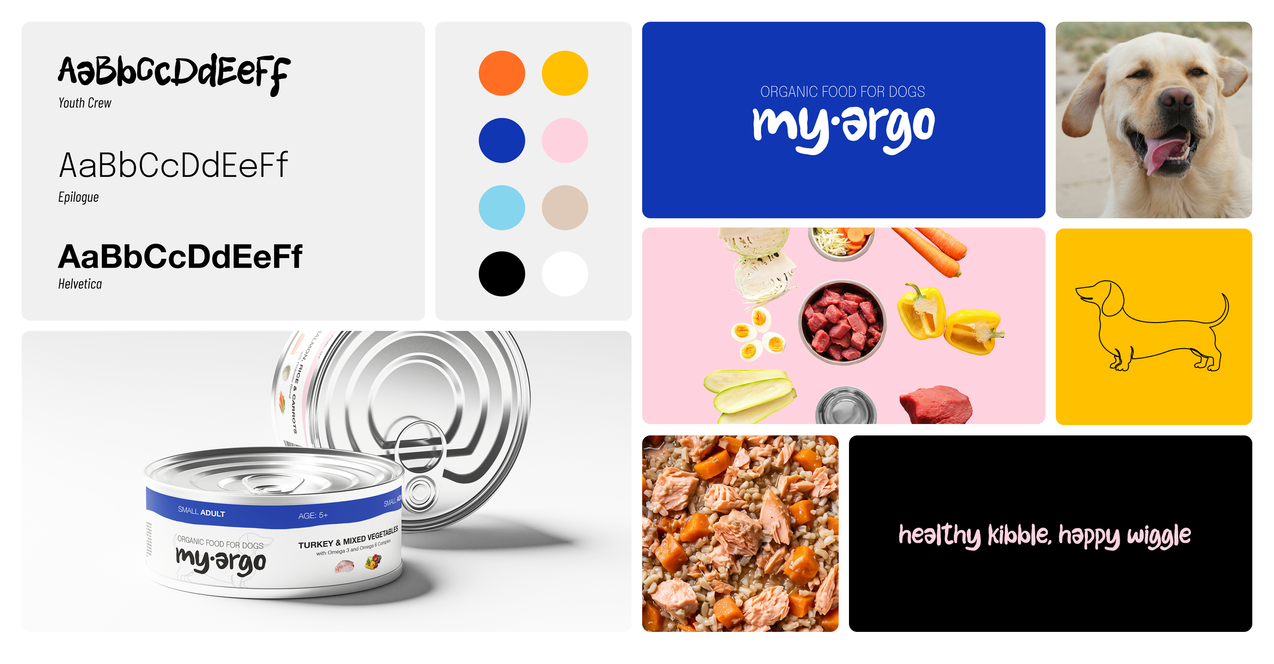
The entire visual system combines warmth and clarity through a bold, hand-lettered wordmark paired with a clean typeface combo to bring legibility and to carry real nutritional information in all of the brand’s products.
The tagline “Healthy kibble, happy wiggle” - along with colourful accents - sets the brand’s voice that sounds warm and friendly. While the rest of the packaging may feel a bit clinical, what supports the brand’s character is the imagery: vivid and colourful photography used in brand’s communication, real and genuine images of the ingredients that shows what truthfully is inside the kibble or wet food. Also… happy dogs, of course.
Colour palette
While the base is neutral and stays the same for each product, what changes is the colour accent that differentiates the cans and pouches based on the size of the dog (small, medium, large) and suggested age. It’s easy for the customers to find what they need by just searching for the right colour.
Within the palette we have a vivid orange and yellow as the primary energetic tones, royal blue as a trust-building anchor colour, and soft pink and sky blue as friendly and lighter accents.
Typography
Since clarity and legibility are two of the main points in this branding, the choice for typography fell mostly on classic sans-serif fonts, Epilogue and Helvetica. Helveticaaaa, aaaaagain? Yeah, love it or hate it, say it’s boring, but after so many decades I still find it one of the best typographic choices for so many purposes. It’s clean, simple, balanced, and versatile.
Illustrations, photography & motifs
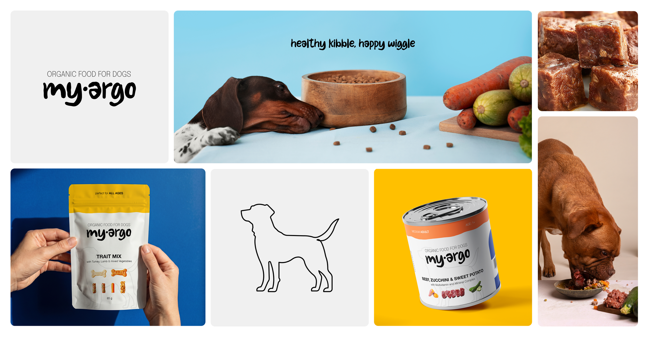
→ A simple dog silhouette, used mainly to depict the size of the dog a product is for
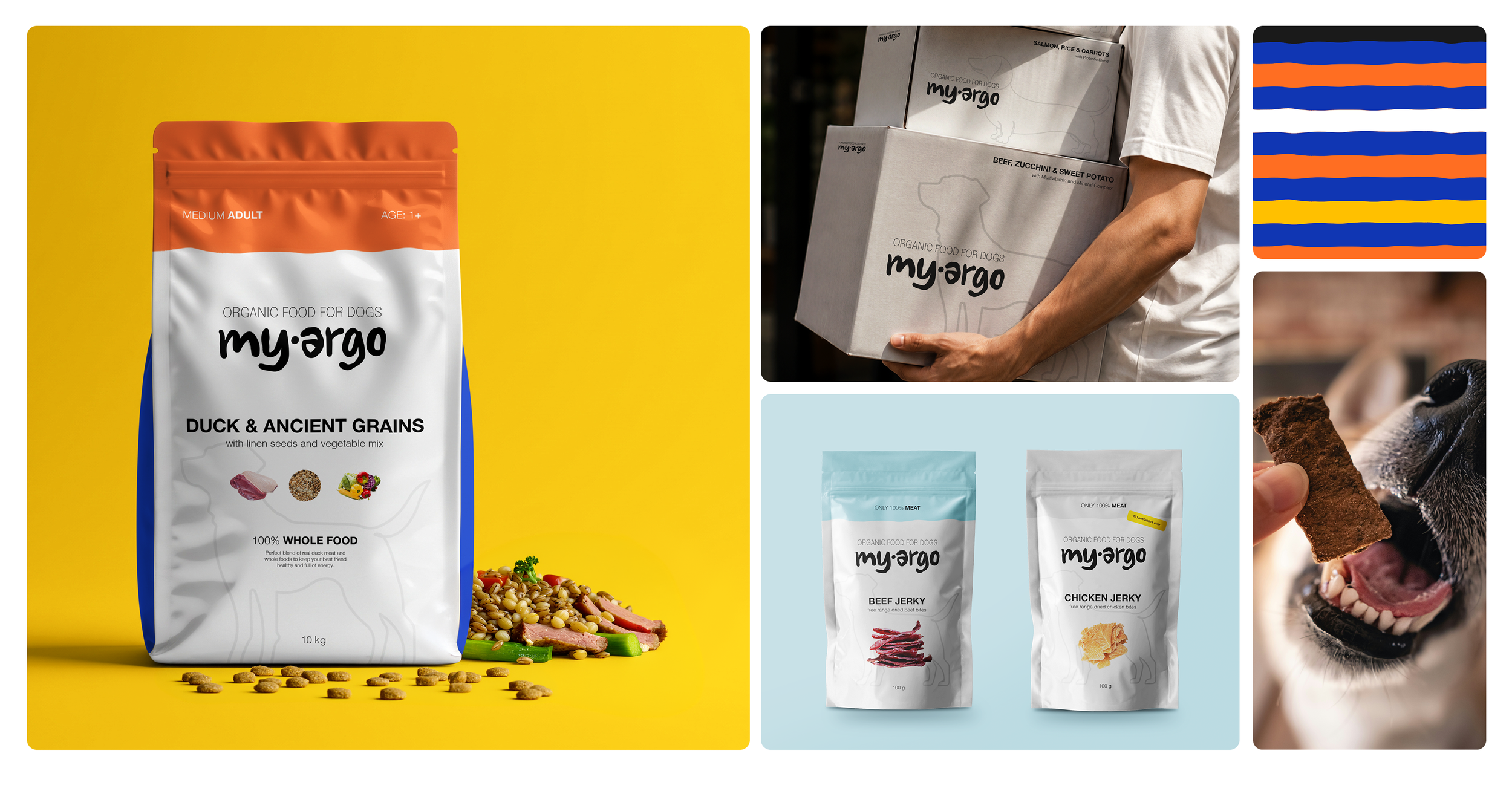
→ A bold stripe system with the brand’s colours that is used to differentiate the target products based on dog size (small, medium, large)
→ Vivid and colourful photography showing the actual healthy ingredients and joyful images of dogs enjoying and/or interacting with the food, reinforcing the “healthy food, happy dog” promise.
Brand application
Dry kibble bags
Large format packaging with ingredient callouts and whole-food messaging, labeled by size and life stage.
Wet food cans
Multiple flavour and weight variants (i.e. Turkey & Mixed Vegetables; Salmon, Rice & Carrots; Beef, Zucchini & Sweet Potato), also labeled by size and life stage.
Treat pouches
Trait mix, different types of dried meat jerkies, you name it. The packaging follows the system and it’s easily readable thanks to the clear typography paired with visual representation of the product.
Shipping & delivery packaging
Branded boxes featuring the logo and the dog silhouette in the background.
Outlook
My Argo has been built to scale across multiple products and make it flexible to adapt to different product lines while keeping its distinct identity. The colour plays the role of the differentiator here and it helps the customers to quickly spot the product they need.
Next step would extend the system even further into retail and digital touchpoints, such as social media graphics and the official website.
Conclusions & final thoughts
I loved designing this one. I’m a big dog person and from a dog owner’s point of view, it was actually interesting to create a brand that I personally would choose among the plethora of loud and unclear products at the pet store.
I feel like nowadays we need to stop over-complicating brands - whether it’s pet food, skin care, candies, whatever - because the more confused your customer is, the less revenue your business generates. Food for thought, no pun intended.