

La Molina
- Pinocchio Collection
Graphic Design
Packaging Design
Client:
La Molina
Industry:
Food & Beverage
Scope:
Chocolate bar packaging design
Project overview:
Revamping of an existing Pinocchio-themed collection of six chocolate bars to make it feel genuinely premium and modern at the same time. This was a design contest that I actually won.
Context
La Molina is a Tuscan artisan chocolate maker based in Quarrata, Italy. In early 2026, they launched a design contest asking for a premium packaging collection of six chocolate bars tied to the story of Pinocchio. This would have been actually a new edition of this collection since they already had one, but wanted to revamp it and make it more high-end.
The brief was clear on what they didn’t want: nothing literal, nothing too illustrative in the obvious sense, nothing that looked like it was designed by a seven-year-old. It had to feel contemporary and premium at the same time.
Well, I entered and this is my winning application project.
Concept
Pinocchio is one of those stories that everybody thinks they know or they immediately think about the Disney version. The original Collodi book is a bit darker and honestly a lot more interesting to work with. There is a wooded puppet who lies, gets hanged from a tree, turns into a donkey, and gets swallowed by a giant fish.
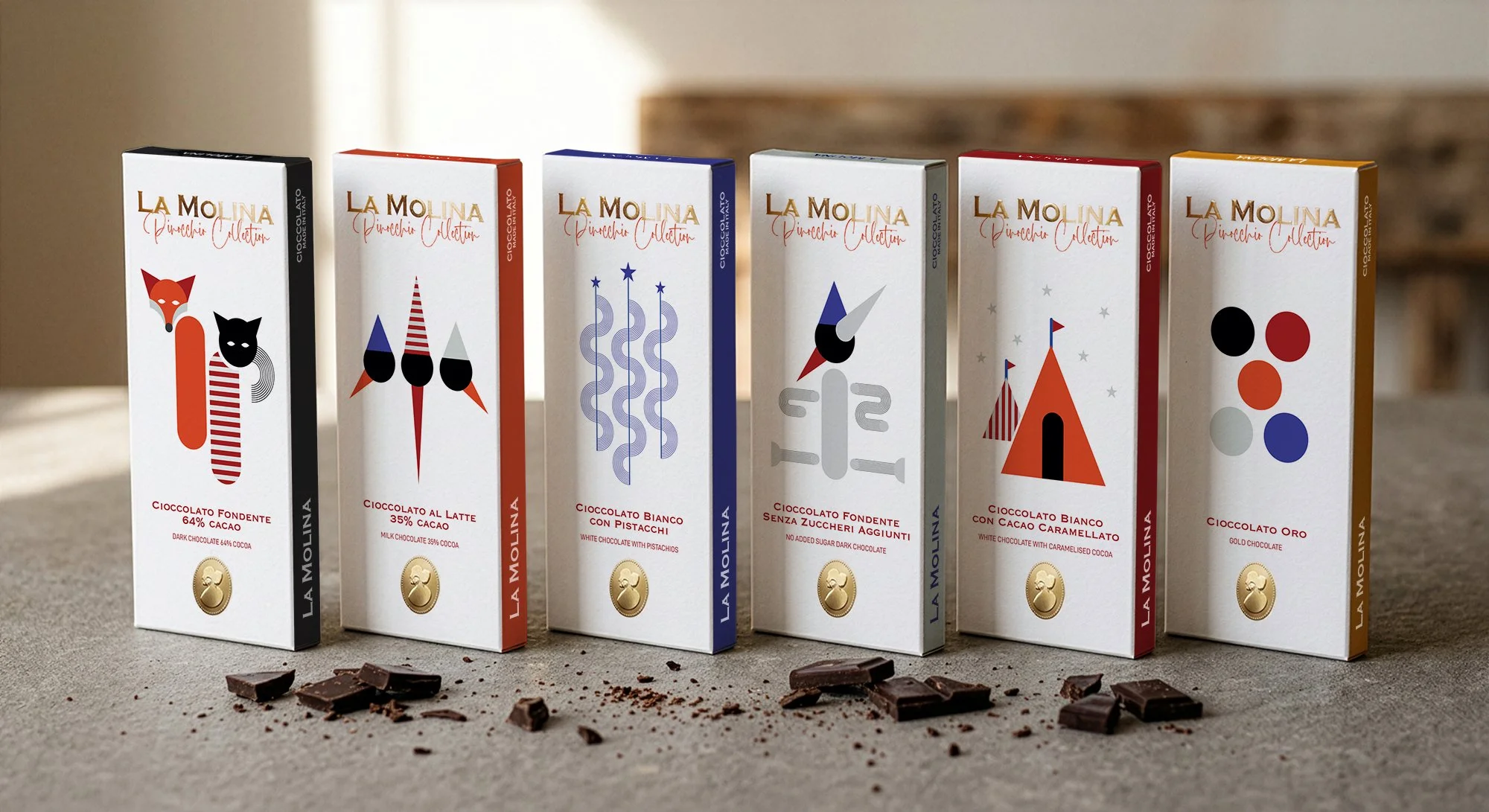
The starting point was pairing of each of the six chocolate types with a character, place, object, or a moment from the story based on taste logic, not just visual association.
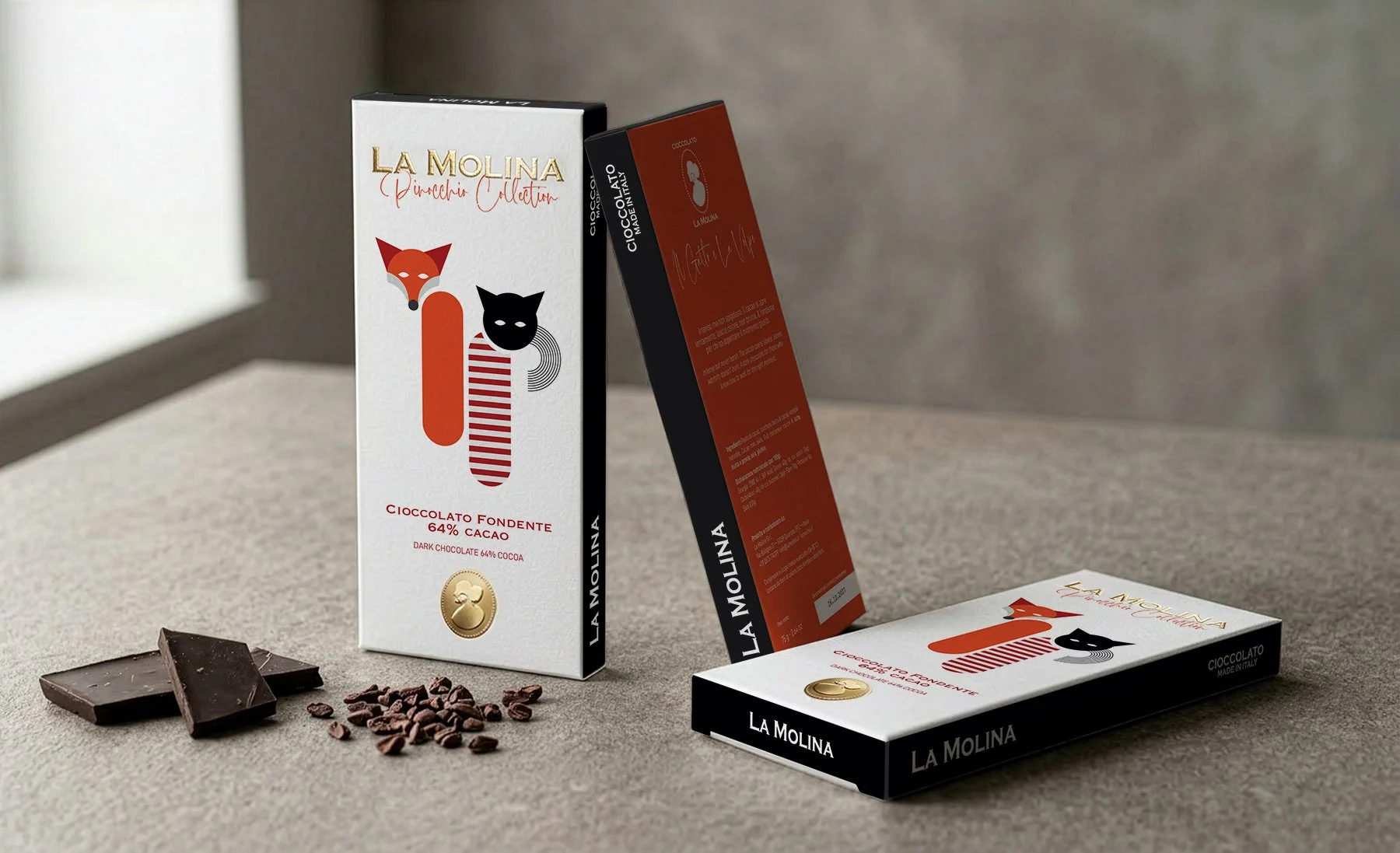
• Dark Chocolate 64% → Il Gatto e La Volpe (The Fox and the Cat)
• Milk Chocolate 35% → Pinocchio
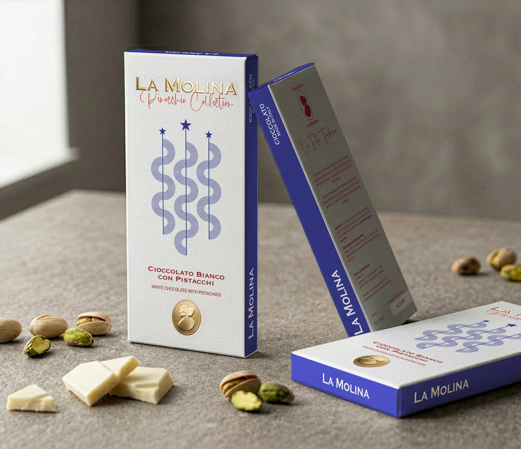
• White Chocolate with Pistachios → La Fata Turchina (The Fairy with Azure Hair)
• Dark Chocolate with no added sugar → Il Ciuchino Pinocchio (The Donkey Pinocchio)
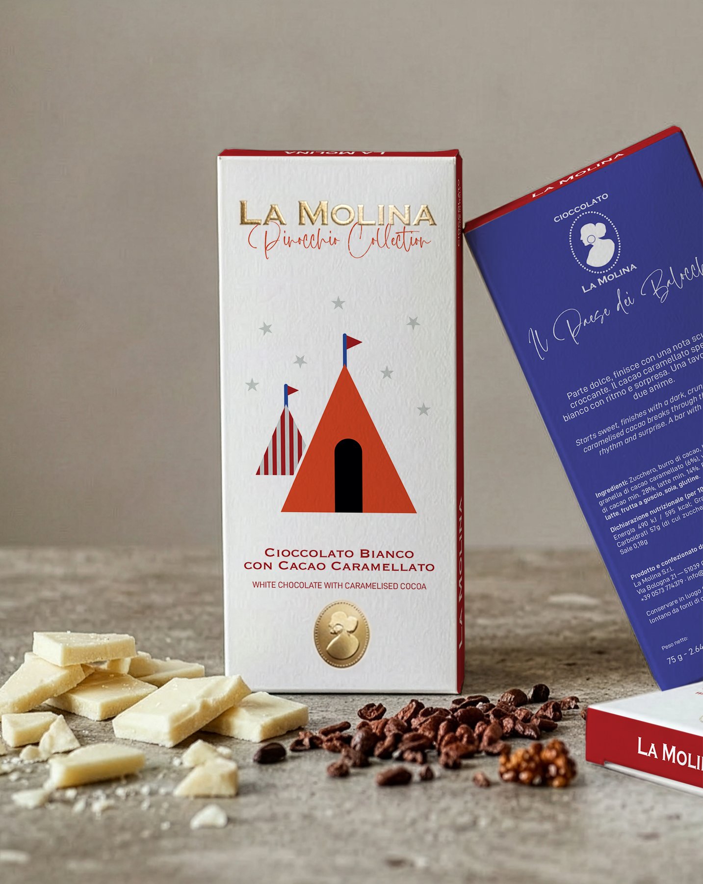
• White Chocolate with Caramelised Cocoa → Il Paese dei Balocchi (Land of Toys)
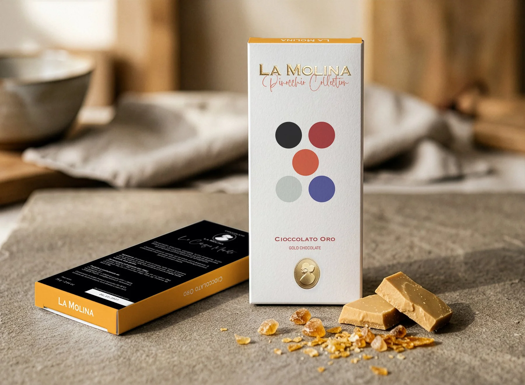
• Gold Chocolate → Le Cinque Monete (Five Coins)
The no-added-sugar dark chocolate paired with Il Ciuchino, to me, is the most uncompromising match in the set. The transformation into a donkey is the point of no sweetness, just the full consequence of bad choices stacking up. A chocolate with nothing added felt like the only honest option here to find a bit of redemption on the horizon.
Design decisions
The brief asked for something modern and not too literal, which is why I opted for minimal and geometric illustrations. Each character or symbol is reduced to essential shapes and follows the same chromatic palette and visual language to remain cohesive across the entire collection.
The front panel is white in all six bars, with the La Molina logo in warm gold embossing. This was a deliberate choice, since neutral colours and gold are firmly burned into consumers’ brains as a common representation of premium quality, which is exactly what La Molina was asking for in this contest. Here’s a side note: sometimes is okay to experiment, but you cannot change the perception of billions of people and their rooted association between colours, shapes and market positioning.
Each bar carries the “Pinocchio Collection” wording directly under the logo, giving this series a proper recognition and identity.
If the front panel acts like a classy frame for the collection, the coloured spines and backs make each bar get its own personality. The six bars, placed together, compose an actual set together rather than random products that ended up on the same shelf.
The characters were selected for two reasons: recognisability, and what they offered graphically. Il Gatto e la Volpe, for example, work as a duo composition. Two figures that are always together in the story, treated as one inseparable form. By the way, that's my favourite bar in the collection.
Colours
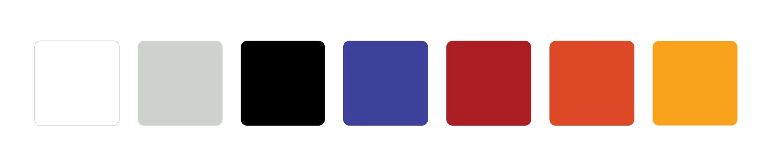
The palette was built around contrast and each colour, again, had to hold its own identity against the white front panel and the gold logo.
The inspiration goes to a broader tradition of Italian graphic design of the postwar period, where colour was a tool for identity before it was a tool for decoration. Albe Steiner, Franco Grignani, the visual language of Italian publishing in the 1950s and 60s, you name it.
Typography
The logotype uses La Molina’s existing brand typography, set in embossed gold foil. The same font is repeated in the chocolate type wording on the front panel, with the addition of a sleek sans-serif for the English translation, both being part of the brand’s existing guidelines.
A new lettering-style font was introduced to differentiate the Pinocchio Collection from La Molina’s other products.
Every section containing typography was designed to follow a clear hierarchy, with the intention of improving the legibility that was lacking in the previous Pinocchio Collection. The brand is now immediately recognisable and the chocolate type easier to read, even with the Italian and English lines sitting together on the front panel.
The back panel is populates mostly by text in the institutional sans-serif. The only callbacks to the front panel are the lettering-style font and La Molina’s brand typeface in the logo mark.



Conclusions
This project was a fun challenge, especially on the modernity vs. premium side. Before landing on this final version, my creative process went through multiple trials and errors. I explored different illustration styles and plenty of font and layout compositions, but in the end these six chocolate bars felt the most fitting to the brief requirements and my own judgement and taste.
Would I change anything, if I could go back in time? Maybe, but I would stick to the same feeling that the current designs give.