

Kuul Haus
- caffetteria / bruncheria
Brand Design
Client:
Kuul Haus
Industry:
Hospitality, Food & Beverage
Scope:
Basic brand design that includes brand strategy, visual identity and collaterals
Project overview:
Some places you visit once and then you forget. Others stay with you in the way the coffee tasted, the light beaming through the window, the feeling of not wanting to leave. Kuul Haus was designed to be the second kind. This is a full brand identity for a caffetteria and bruncheria concept, a place built for the kind of people who take their flat white seriously and eat brunch at noon without guilt or apology in a place that feels genuinely welcoming… and is obviously cool.
The brief
The concept was super clear from the start: a caffetteria/bruncheria targeting Gen Z and Millennials, offering breakfast, brunch, afternoon tea, and a menu worth coming back for.
A place with a real personality, bold, vibrant, judgement-free, biological, sustainable, and good enough that you think about it next time you eat somewhere disappointing.
The visual brief was meant to be exactly like that. Young and vibrant.
The name
Kuul Haus. Deliberately misspelled and hella Germanic. The name was drawn from a deep admiration for German youth culture, its confidence, its directness and incredible coolness, translated into something equally cool but also warm and inviting. A cool house. A place you want to hang out with your friend in - or by yourself. We don’t judge.
The visual system
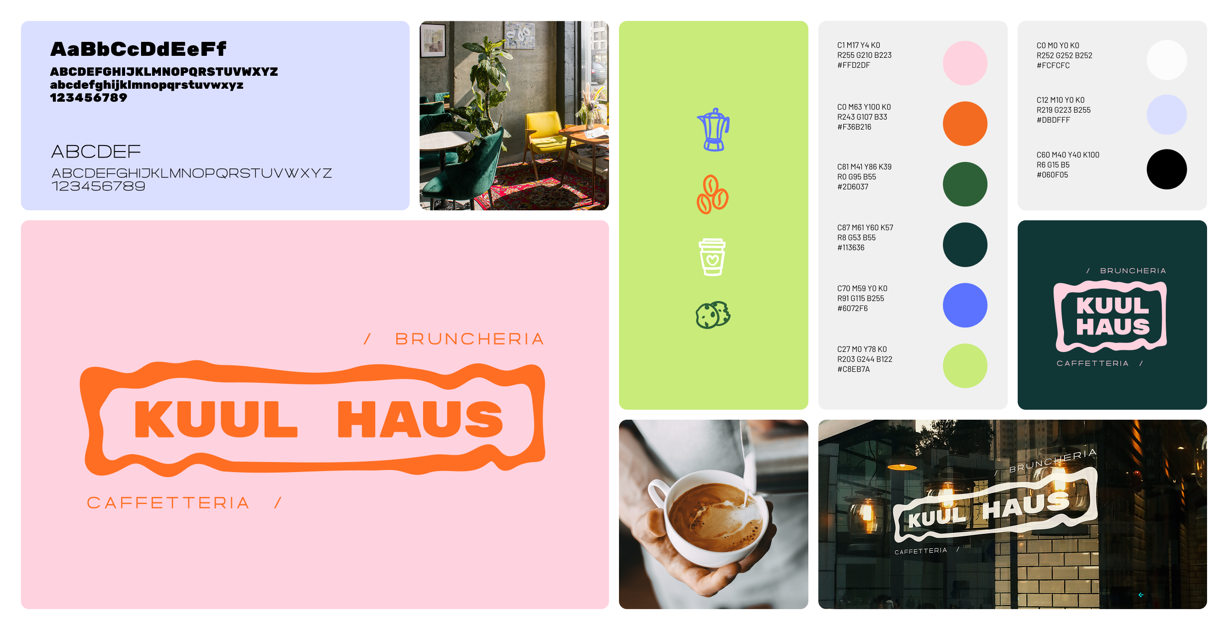
The centrepiece is a wobbly, organic shape containing the Kuul Haus wordmark in heavy typeface. The badge shape is the brand’s most distinctive element and it’s structured enough to read as a logo and feel human and youthful at the same time.
The “/” marks flanking “Bruncheria” and “Caffetteria” are small and intentional typographic choice to add rhythm and quietly tell you that this brand thinks about details in every context.
Colour palette
The palette floats around soft and vibrant shades and its primary ones are set in pinks, oranges and greens. We also have supporting blues and neutrals that can add variety to the brand’s assets and applications.
Typography
The visual system is composed by two typefaces. The first one is a bold and geometric sans-serif for heading and display, which is a clean choice and very much at home in the German design tradition that the brand gets its inspiration from. Then we have a complementary lighter weight font for body copy and supporting text.
Illustrations & motifs
To bring Kuul Haus to life beyond typography and colour, I added a set of single-coloured illustrations and icons with a loose, sketchy strokes and intentional imperfections. The somewhat vintage style matches the interior design and the choice of gathering second-hand furniture from the previous century, making it all lively and warm.
Brand application
Menus
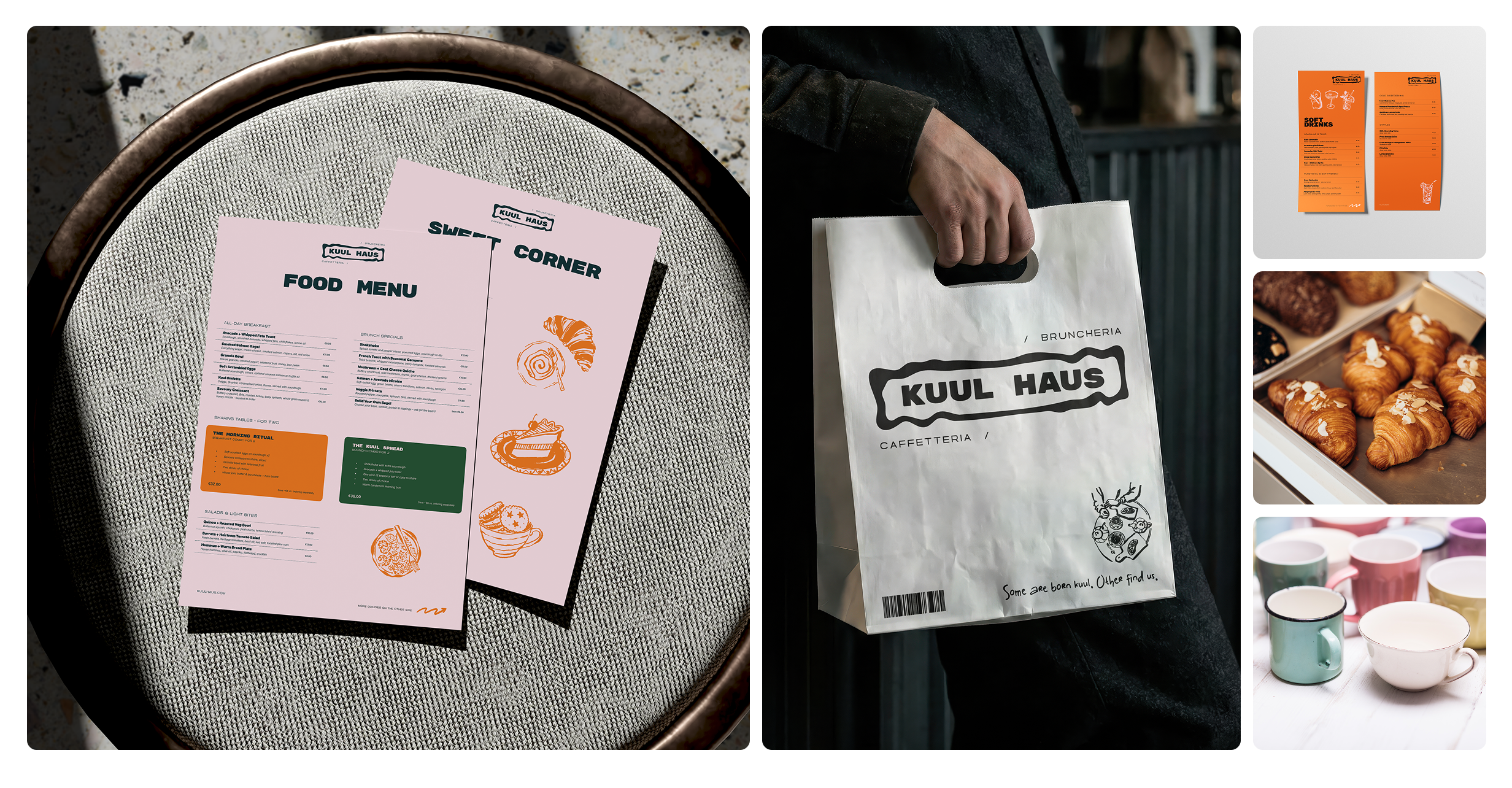
Old school and overwhelming menus? Nah, we don’t want that. For Kuul Haus, I decided to opt for a menu suite composed by a one big menu dedicated to food (both sided) and two thinner ones focused on coffee & tea and soft drinks. Each is colour coded for a quicker distinction and usage.
Take-away packaging
Along the take-away paper cups, the paper bag is the brand’s most public-facing application. It is simple and it doesn’t chase an appearance that doesn’t fit the style of the menu suite: we have obviously the logo, a small illustration in the same hand-drawn style as the ones present on the menus, and a short tagline “Some are born kuul. Other find us.” - a line that captures the youthful character of the brand.
In-situ application
A shop window always needs a logo. Period.
Outlook
Kuul Haus is a concept. Every element needed to launch this brand exist and it allows to expand it at any given moment in the future. What remains is a space, a kitchen, a good Italian coffee machine and a ton of second-hand furniture to give this space and authentic feeling.
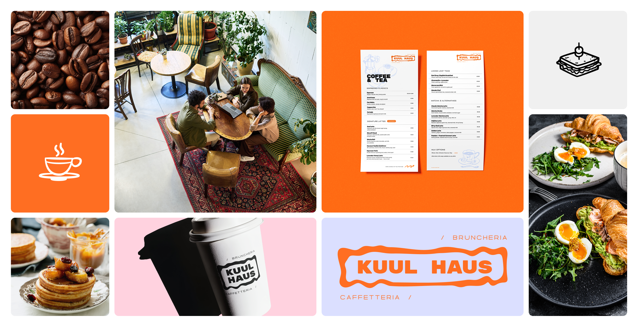
The brand has room to grow too. Social media templates, seasonal menu variations, merch, loyalty card design, you name it. The visual system is flexible enough to extend into all of it without loosing coherence. And that, my dudes, was the goal from the beginning.
Conclusions
If I wasn’t a designer, I would probably be a coffee shop owner. There is something about hospitality services that inspire me in many ways, especially when I think about a place that I would love to go to multiple times a week. Most of the time, I want to create the visuals for such places because I, in the first place, am a sucker for cool environments, nicely printed menus, great food and drinks.
This project was about all of that. Would I change anything? Not really. I would maybe expand the applications list and create a couple of patterns that could be used on the take-away packaging, maybe some t-shirts.