

Il Sicano
Brand Identity
Packaging
Client:
Il Sicano (self-initiated concept)
Industry:
Food & Beverages - Spirits
Scope:
Naming, custom logotype, label & packaging design, range architecture, art direction
Project overview:
The climate is changing and do you know what is now possible? Growing agave in Sicily. My partner once said “If something goes wrong my current job, I will open a distilleria” and his first thought was about a 100% “Sicilian Mezcal”. This projects explores exactly that: a genuine idea that could potentially become reality in the near future.
The brief
In the era of rampant climate change, farmers are adapting and finding new ways of growing produce that wasn’t that much common in certain areas. In the case of Sicily, we are already seeing local avocados, mangos and papayas, and it’s kinda logical to harvest agave next. There are already some agave species present in that arid climat, however they were never used in distillation practices.
This is where Il Sicano takes its place. It’s the first Italian agave spirit, made in small batches in the tradition of Mexico’s great distillers, but rooted entirely in Sicilian ground. The brief itself was pretty open to exploration, but it had to follow one specific rule: no Mexican imagery. No Dias de los Muertos, no mexican motifs. Just make it look Italian.
The name
Il Sicano is straightforward and refers to the Sicani, one of the oldest inhabitants of Sicily. It pokes the island’s indigenous roots, echoing the deep heritage agave still carries in Mexico, but presenting it in an Italian way.
It sounds good, it’s tied to Sicilian history, it’s easy to pronouce internationally, and unintentionally could make a fun hidden word play… In Italy “Mexican” is translated as “messicano”. Ha! Have you spotted it yet?
Creative Direction
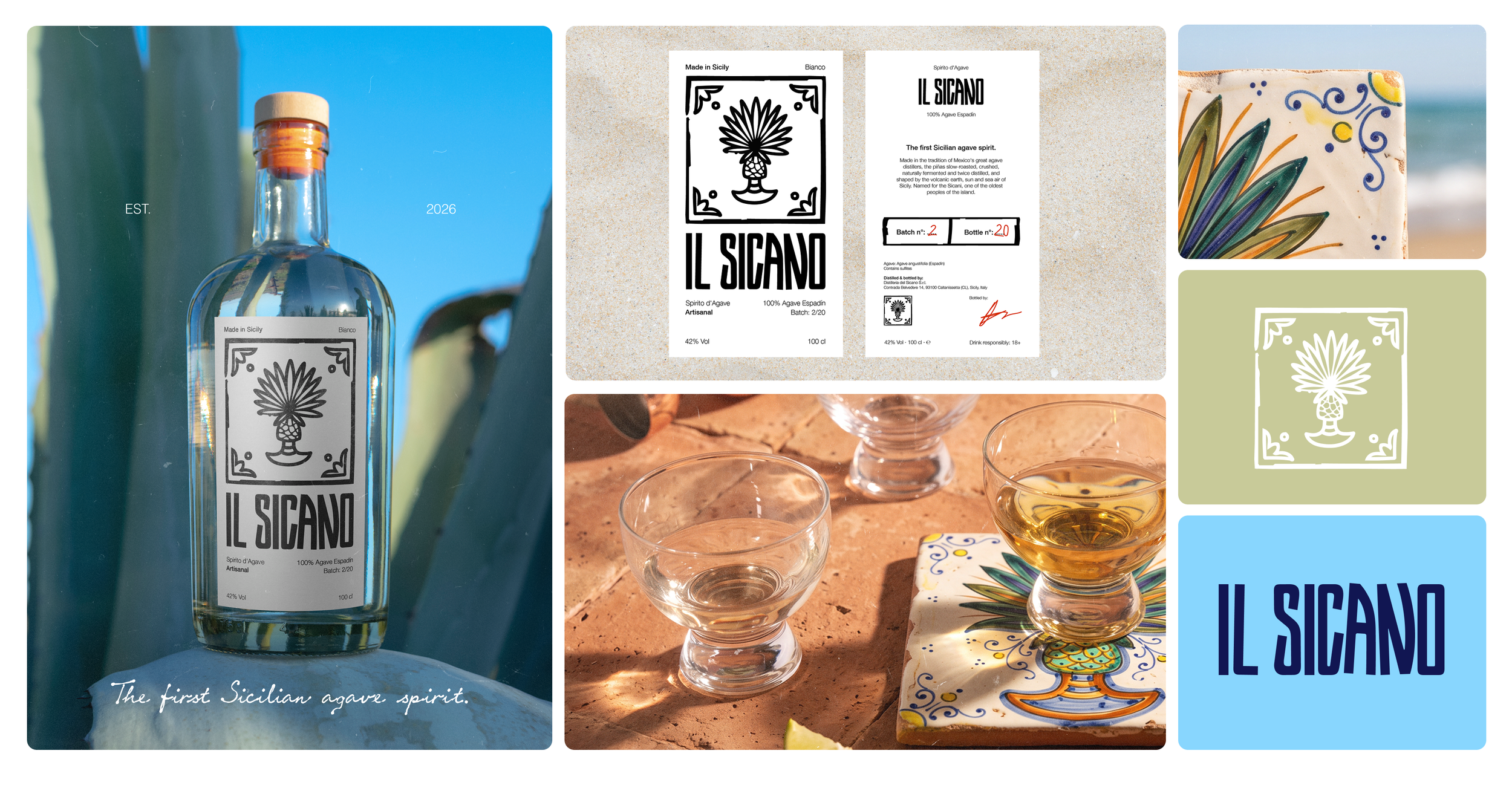
We have a wordmark rooted in Hoskin typeface, that has been tweaked and customised to give it a more personalised feel. The logomark is hand-drawn to reinforce the idea of craftsmanship and a more rustic and traditional look. The idea behind the logomark brings together the two worlds: the Mexican tradition of agave and the Sicilian art of ceramics. When agave is harvested, its trimmed heart is shaped like a pinecone, very similar to the Sicilian ceramic pigna, a centuries-old island symbol of welcome, fertility and good fortune. The mark fuses the two into a single form.
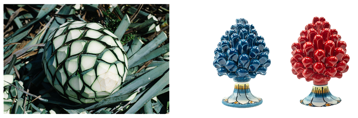
The colour palette is treated in a very flexible way. It is intentionally chosen to be timeless and suit every type of campaign, season or photography without the need to stick to a specific palette in order to stay relevant and on-brand. The real strenght is in the wordmark and logomark, which can lead in whatever colour is being chosen for a specific context.
The art direction, however, generally brings the warmth of the Sicilian sea, sun, terracotta, and the hand-painted ceramic tiles that are considered one of the most traditional artworks of the island. Beyond the bottle, the identity aims to bring this traditional craft into the picture. In fact, Il Sicano invites local ceramisti to hand-paint their own interpretations of the logomark onto those tiles, that can be used as coasters for drinks and bottles. This paid collaboration could be a winning commercial tactic for collectors, casual people enjoying both an equisite spirit and a piece of art and design, but also a great opportunity for ceramic studios to advertise themselves and keep this traditional art alive outside Sicily.
Packaging
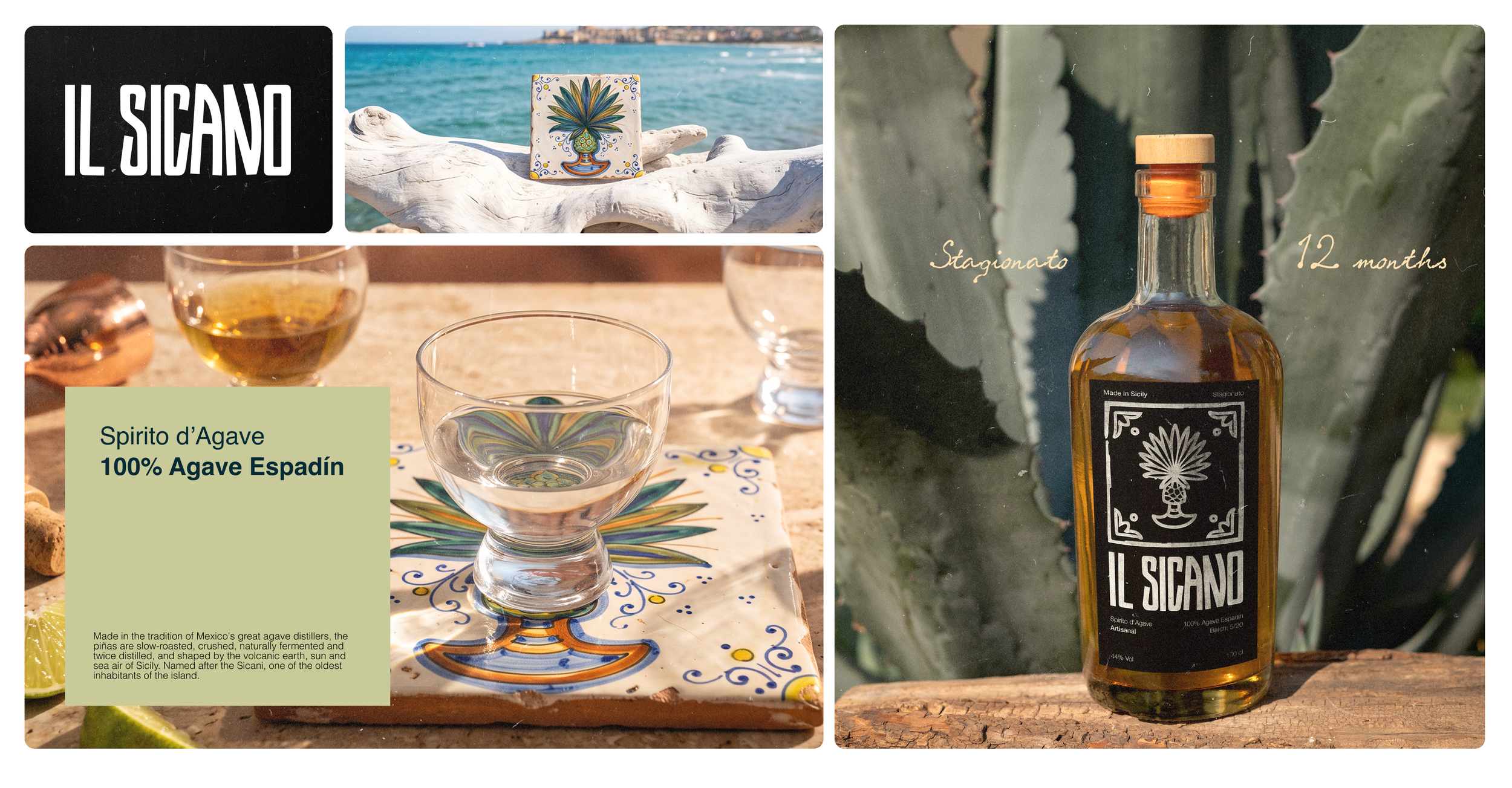
The range splits into two expressions in the most simplest way possible: an inverted label. Nothing innovative here, but sometimes it’s good to stick to a language that is alreade heavily imprinted in customers’ minds without asking them to overthink and interpret the packaging they’re looking at.
We have the same system with opposite tones that suits both versions of the spirit: Bianco, the unaged one, wears white, and Stagionato, rested twelve months, wears black.
Every label carries the full ritual of a real agave spirit - we’re talking the must-have information, such as Spirito d’Agave (obviously we can’t use the name Mezcal because it’s protected by denomination of origin), 100% agave espadín, batch number, and a bit of the spirit’s story and profile. The back label contains an empty space dedicated to manually recording the batch, the bottle number, and the signature of the person the bottled the spirit.
Outlook
Il Sicano is a concept that could easily exist tomorrow with the name, mark, range, packaging, and an artisanal collaboration that does the Sicilian craft justice. From an idea to a possible business è un’attimo, and building something on your own terms gives this potential brand not only character, but also opportunity to bring something unique to the market.
Conclusions & final thoughts
Loved this one so much! It was very exciting to jump into the Sicilian culture and create a custom brand and packaging that borrows the core ingredients from the other part of the world and makes it theirs. This concept leaves room to expantion to limited edition gift packaging, website, social graphics, etc.