

Good Fellas - Pizzeria Italiana
Brand Identity
Packaging
Client:
-
Industry:
Food & Beverage - Italian pizzeria, casual dining, take-away
Scope:
Full brand identity - naming, logotype, visual identity system, packaging design, brand application
Project overview:
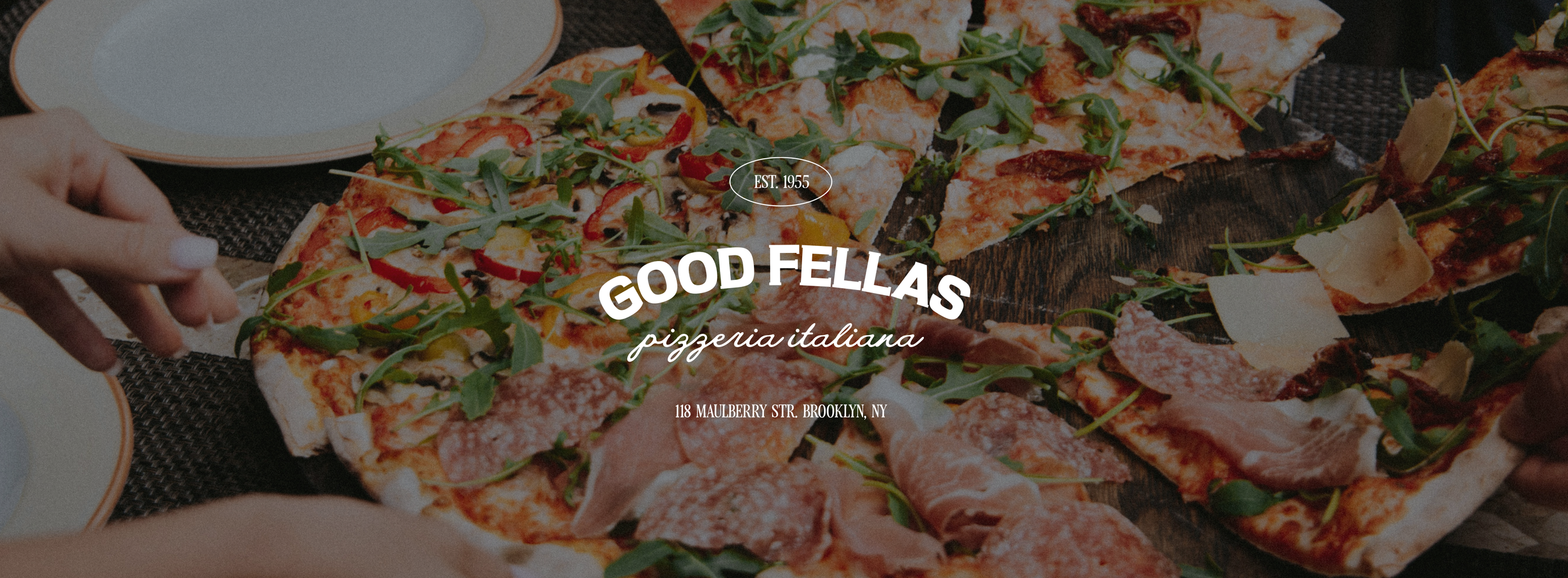
Good Fellas is a concept pizzeria brand birthed from a simple idea that pizza was born as food for everyone, and it should stay that way. The project explores what an unpretentious Italian pizzeria should look like in order to appear modern and evergreen at the same time, because, you know, trends come and go, but an authentic pizza is here to stay.
The brief
Design an identity for a pizzeria serving authentic, thin-crust Italian pizza at honest prices, welcoming all ages and budgets, and without compromising on style.
The positioning starts in Naples, where pizza was - and still is - one of the cheapest and most accessible foods for people. Good Fellas takes exactly that spirit from tradition and brings not only the accessibility to the table, but also offers high quality ingredients, impeccable technique, and that confident approach of being a trend-proof brand/restaurant.
The visual identity had to be timeless. The only constraint was to avoid red colour and checkered patterns, which are massively overused and abused in any pizzeria branding out there.
The name
Good Fellas is a name that brings a sense of community and familiarity, and makes you think of that kind of place where everyone is treated like an old friend. It intentionally avoids the more common route of using Italian names (ex. Nino’s, Da Salvo) because, again, they are widely overused. I would have used an actual Italian name if the client were adamant about it for maybe family, sentimental or hereditary reasons.
The visual system
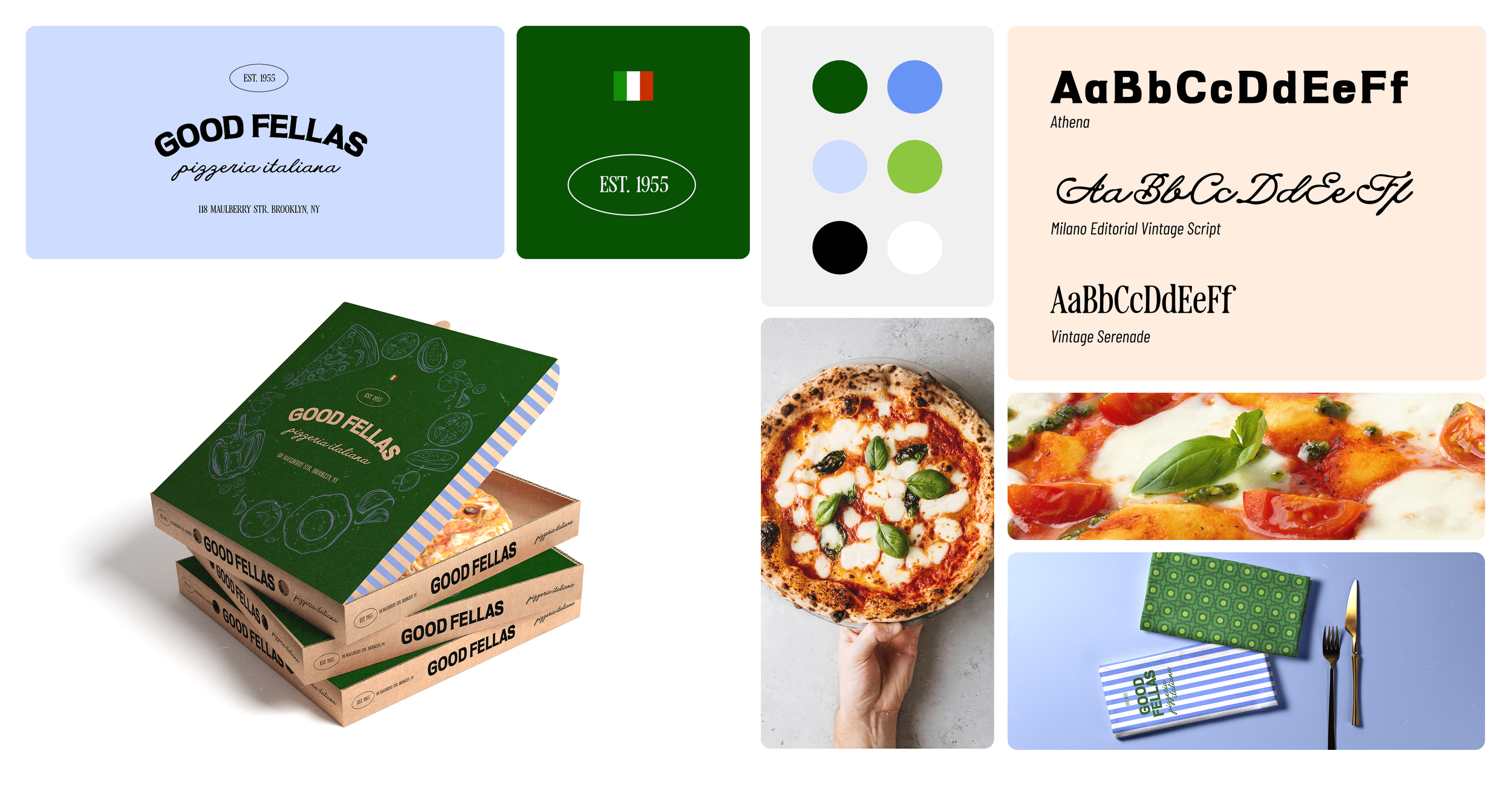
The timelessness of this brand is marked first and foremost by a bold wordmark in tandem with a vintage-looking script typeface. Both are combined in a classic American signature structure (hello, we are in Brooklyn) that includes the establishment date and the address.
The logo itself is adaptable for different touchpoints and applications: it can be shortened, straightened, stacked, you name it. Its force lies in the typeface choice for the “Good Fellas” wordmark, which is recognisable in many ways and representations.
Colour palette
The chosen colour palette might be an unusual one for a pizzeria. We often see brandings being dominated by red shades, without exploring tones the other side of the colour wheel. For Good Fellas I went exactly in that opposite direction, to break the standards and common expectations.
We have a deep forest green as the main colour that sets the tone for tradition and trust; a light cornflower blue and periwinkle as secondary colours that heavily support the visuals, especially within the illustrations and patterns. There is also a light leaf green as an accent colour that revives the deep green, making it more approachable and less “expensive-looking”.
Typography
Three typefaces have been chosen for Good Fellas: a bold serif for the primary wordmark with an intentional stamped-signage feel; a loose yet elegant script font to add warmth and a vintage vibe; a classic serif for additional information included in the signage.
Illustrations & patterns
Who said that you can’t have two different patters in your branding? Yeah, nobody. For this identity I paired two distinct patterns that are not the classic checkered one. We have vertical stripes and an old Italian tile-like pattern that work together in an unexpected way and can be used on multiple applications, together or separately.
As an addition to potential on- and offline collaterals, such as pizza boxes, brochures, or social graphics, a series of outlined food illustrations rounds out the brand assets.
Brand application
Pizza boxes
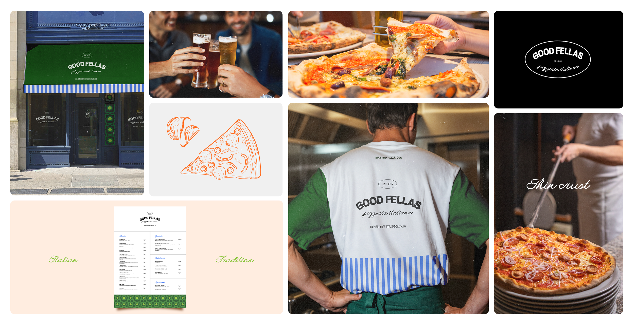
Since Good Fellas is a pizzeria that also offers take-away, the creation of pizza boxes was a must. When it comes to take-away, I feel like whatever packaging you’re giving away is worth more than a business card. It has to be eye-catching and memorable, and that’s why, in this case, even the inner flaps are customised.
Menu
Simple and easy to read. Can be expanded, laminated, put in a hard cover, you name it. It’s extremely versatile and foolproof.
Napkins
Double napkins for each place, if you wanna dine in - one for your lap, one for your hands. The same pattern could also be used for take-away paper napkins.
T-shirts
Simply staff and merchandise apparel, customised mostly on the back. The front remains blank with just the logo on the upper left side.
Outlook
This brand, even though it’s just a concept, is a brand that doesn’t need to reinvent itself completely every single year. It’s been built to ignore the trends and proudly stay relevant over time.
It also leaves room for expansion: the official website, social graphics, posters, brochures. All of those would follow the visual system and photography that truthfully showcases their culinary creations, friendly approach and fresh ingredients.
Conclusions & final thoughts
Definitely could have expanded this one a bit more, but since I was focused mostly on the concept, it felt like enough to present the general idea of an authentic brand that holds against the passing of time and that is different from a typical red-checkered, big-eyed mascot pizzeria that we often see out there.