

Client Dashboard
UX/UI Design
Client:
Wesii
Industry:
B2B SaaS, Renewable Energy
Scope:
End-to-end UX/UI Design - research, user stories, wire-frames, high fidelity mockups and prototypes
Project overview:
A B2B SaaS platform is only as good as the experience it offers to people who rely on it every day. This project was about building a dedicated client dashboard from the ground up for a company operating in the renewable energy sector. They didn’t have it before, now they do.
This project is covered by NDA. Details are intentionally kept broad and visuals are selected excerpts from the final deliverables.
The problem
Wesii’s clients had no dedicated space to manage properly their solar assets. Inspections, payments, KPIs, portfolios… everything existed somewhere, but nowhere in particular. They could retrieve a small percentage of the information from Wesii’s old fashioned and messy web portal, but it wasn’t enough, especially not for people that take photovoltaic plant ownership and management seriously.
The fragmentation and messiness weren’t just inconvenient. For clients managing large portfolios it meant constantly switching between tools and pages, chasing information that should have been immediately available in one place.
Before this project officially started, I pinpointed the following major issues:
Connection between Web Portal and the new Client Dashboard: from my perspective, all of it should exist in one platform without forcing clients to switch them constantly. Since Wesii didn’t want to fix their major problem, which is being their Web Portal and database, the only option to develop the Client Dashboard was to build it in a separate environment. And hope for the best.
Need to view and manage ALL information: in the past, clients could only view the inspection output, but they didn’t have direct access to order payments, survey status, alerts and updates happening in real time, potential future purchases, etc.
Need to have a clean and easy to navigate platform: if Wesii’s Web Portal taught me something, it’s definitely the fact that UI matters as much as UX. Especially when it comes to hierarchy and specific steps that we want our users to follow without feeling cognitively overwhelmed.
Starting from scratch,
without the users
Here’s the honest part: I had no direct access to end users. No interviews, no usability testing at the research stage, no feedback loops with actual clients, just desk research, no permission to contact the clients, competitive analysis, and a thorough mapping of the product’s context in the industry.
It’s not the ideal starting point for a UX project and I’ll be the first to say so, but constraints - to my dismay - are part of the job, and working within them is a skill in itself. From the research I had, I built a set of user stories that became the backbone of every design decision that followed afterwards.
This was also one of the reasons I’d do things differently next time. More on that later.
From sketches to screens
The process started messily, as it should, and before any wireframe was created in Figma, there were sketches. I find it to be a necessary step in every design and creative process, as it unlocks ideas that otherwise would never come to life.
↓
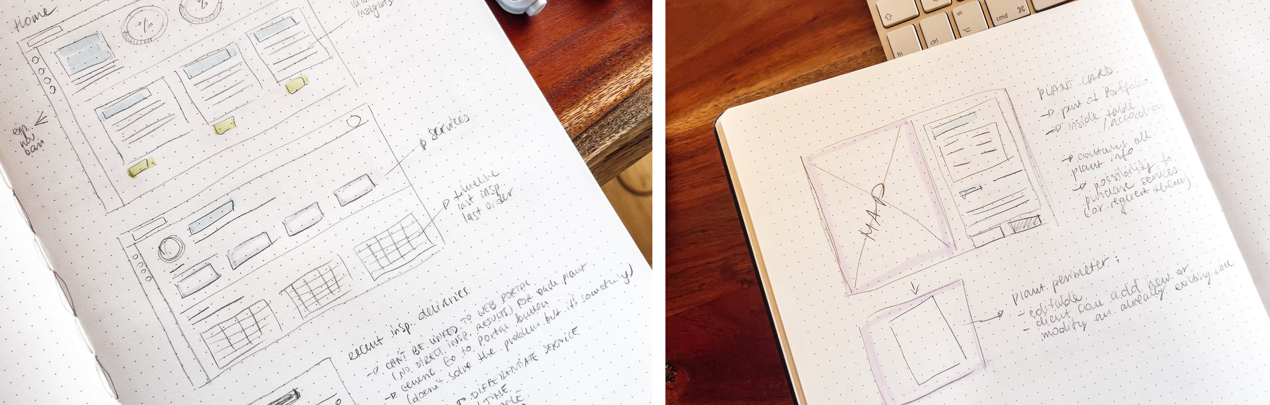
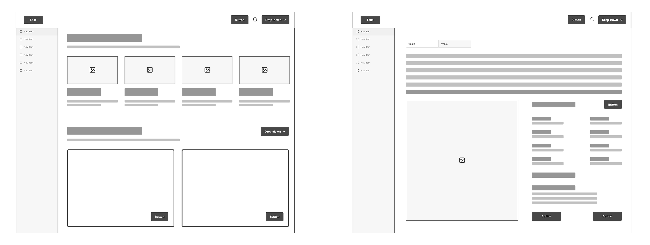
From there, the structure translated into low fidelity wireframes that were focused on blocks and layouts. This stage is also dear to my heart and my entire process. It may feel futile to some people, but to me is a grounding step that sets the selected direction towards high fidelity mockups and prototyping.
↓
High fidelity mockups came last, once the structure was solid enough to build on.
↓
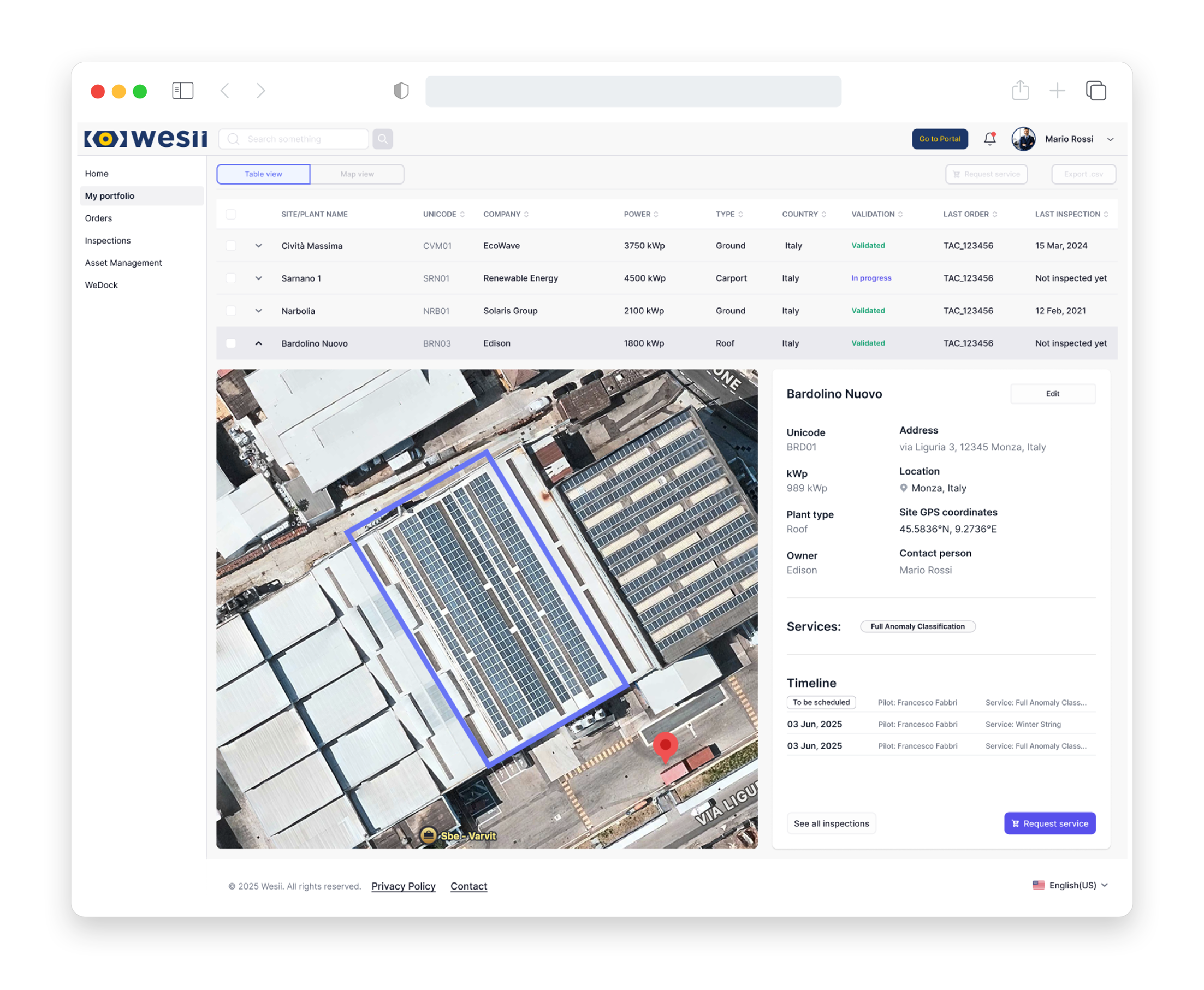
By the time I left the company, the project has been handed off to the development team and was moving into build.
I wasn’t there to see it go live or collect client feedback, which is its own kind of lesson in letting go of work you cared about.
The solution
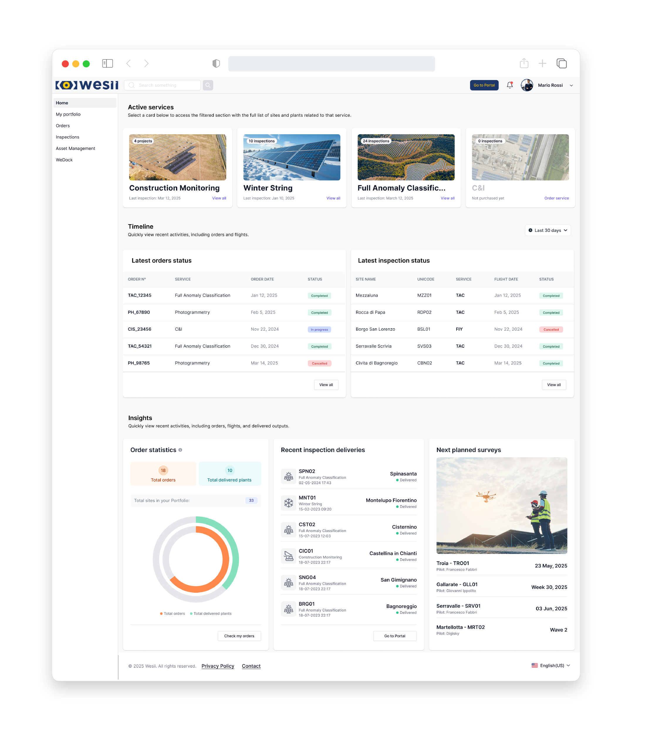
The result was a clean dashboard built around functional core areas that allows a client to monitor, manage and act on their solar assets, consolidated into one place.
The guiding principle was simplicity in service of clarity. This is not a tool for designers or developers. It’s a platform for people managing real infrastructure, often under time pressure, who need information to be immediately readable and actions to be immediately obvious. Every layout decision, hierarchy choice, label, button and card were filtered through several questions about WHAT and WHY they should matter to end users.
A few things that shaped the design:
Reducing cognitive overload: The design uses progressive disclosure showing what’s essential first, with detail available on demand.
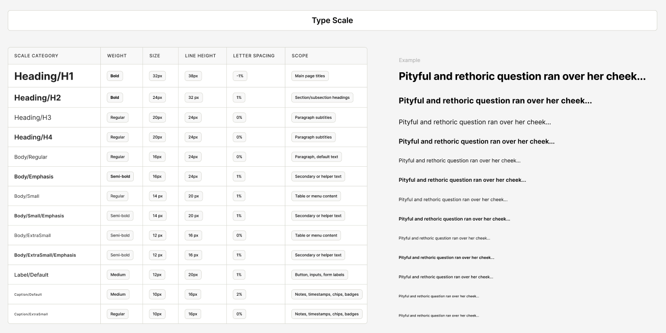
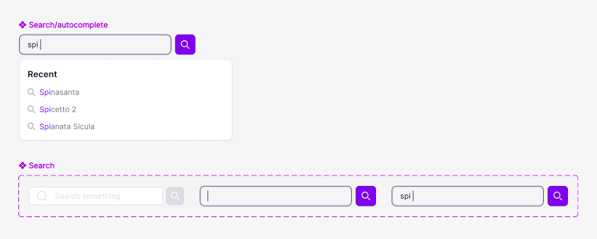
Consistency across sections: With distinct functional areas, the risk was ending up with multiple interfaces that felt like different products. A shared visual language and consistent component behaviour kept the experience coherent from one section to the next.
Actionability: Every metric, status indicator, card, etc. was designed to make it easy to clients to read information and make sensical choices in real time.
What I would do differently
next time
Two things, and I feel strongly about both.
First: I would fight harder for direct user research. Even a handful of client interviews at the start would have added depth and confidence to the user stories that desk research alone couldn’t provide. Good UX starts with real people, and that’s not a principle I’d compromise on again.
Second: I would push for a design system from day one. Building components consistently across multiple sections without a formalised system is manageable until it isn’t. A proper design system would not only make the entire process faster, but it would allow a professional approach and consistency with other digital products that Wesii offers (web portal and mobile app).
Both lessons are learned and will be carried forward. The best constraints are the ones that teach you something, and this project had plenty of both.