

City of Genova
- a new brand identity
Brand Design
Client:
-
Industry:
Public Sector, Tourism, Place Branding
Scope:
Research and audit, brand strategy, brand architecture, visual identity, motif system, print and digital applications
Project overview:
If you ask anybody what’s Genova’s branding system, most likely nobody will give you a solid answer. There are different touchpoints masquerading as something else - visitgenoa.it, for instance, behaving like the city’s whole identity when actually it’s meant to be the tourism arm. To me… it’s kind of confusing.
Fair warning: there’s a lot to read here. It’s an in-depth project, and the point is to show the analytical and strategic thinking just as much as the visuals.
Note: this is an unsolicited, self-initiated concept project created for portfolio purposes. It is not affiliated with, commissioned by, or endorsed by the city of Genova, its tourism board, or the Comune di Genova.
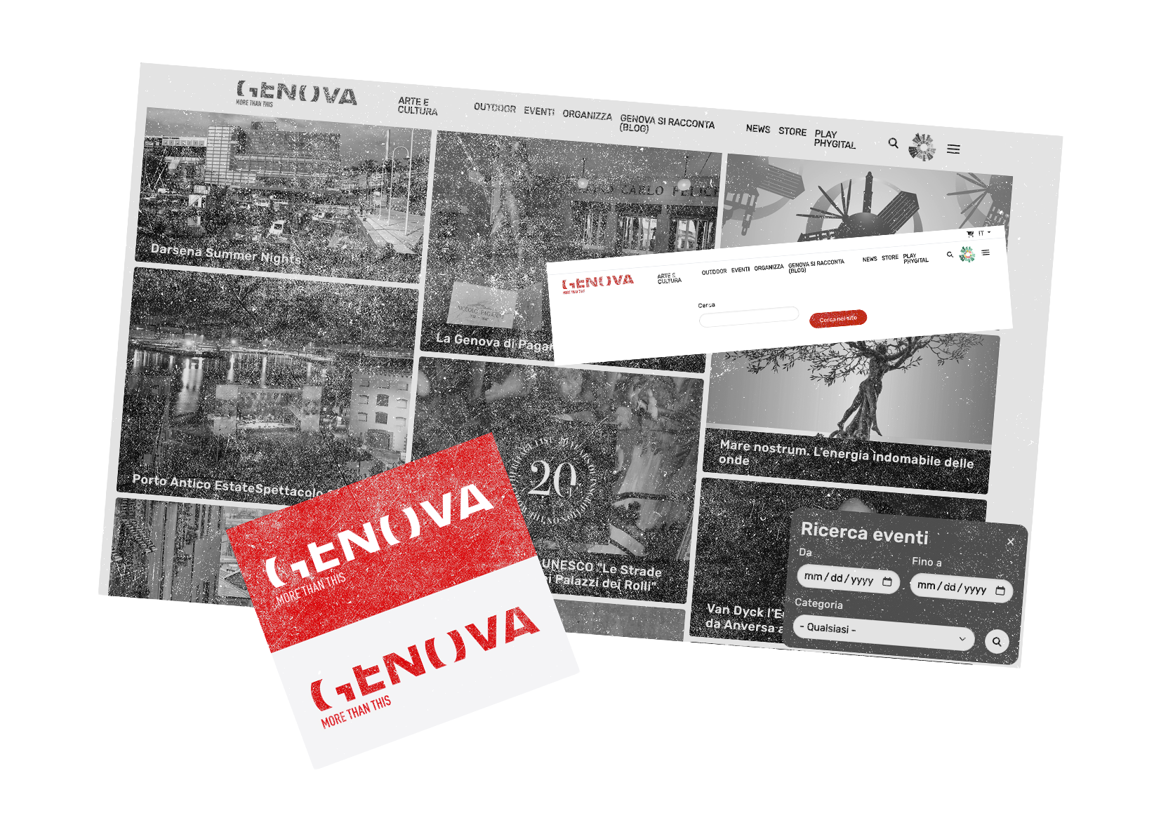
It actually started with the tourism website…
I live an hour from Genova. I’ve been there many times, got lost in the vicoli and genuinely been amazed about the multifaceted and history that this city offers on a daily basis. That last thing is a baseline for a strategy that would elevate Genova to its big city siblings that receive more tourists’ attention than Genova itself.
My initial research and concept rebrand was meant to be focused on Visit Genova since the website presented a lot on inconsistencies, weird logo with a confusing payoff, bugs, UI issues, you name it.
Easy, I thought. Fix the website, fix the logo, done, arrivederci e grazie.
Then I started digging a bit more and the project literally exploded in my hands. I realised that “Genova - More than this” is actually the city branding, not the tourism expression. I dug up again and found out that the city has two more sub-brands, an abandoned website of dubious content and target, and a struggle to have a consistent and coherent identity that is not just standing behind a logo and a colour palette or the institutional portal.
That’s where I realised that rebranding the tourism arm wouldn’t be enough because it doesn’t solve the problem: Genova needed a single city brand that speaks in the first place to its citizens, then to tourists, while being open to innovation, investments and offering opportunities to young people.
The audit
Hold on, this section is a bit long to read, but it gathers information that triggered some decision making during the rebranding process.
Also… a slight change of tone because we gotta be professional here.
The current brand
What presents itself as Genova’s city brand is, in practice, several brands running in parallel - each speaking to a different audience from behind its own logo, palette, and website, and each apparently unaware of the others.
The most familiar of them is “Genova More Than This”, launched in 2014 through the EU Urban-City Logo program and authored by Valeria Morando and Anna Giudice of studio 7vicocrema. It was conceived from the outset as a full city brand: the language around its launch was explicit that the brand of a great city carries tourism, investment, culture, and civic pride together, and that this was “a logo not for the Comune, but for the city”, meant to be understood, shared, and lived by every Genovese - which wasn’t the case because the brand received mixed critics. Today it endures mainly as the identity of the tourism portal, visitgenoa.it, and its associated channels.
On the other side we have a second territorial identity, largely invisible to the tourism audience. Launched around 2018 as “Genova Meravigliosa”, it now lives on as “Invest in Genova”, operated by the Comune’s territorial marketing office. This is the city’s investment and regeneration face, addressing businesses, the international real-estate community at MIPIM, transportation, and the innovative talent Genova hopes to attract and keep.
The current “Genova Meravigliosa” is just an abandoned website that back in time provided a quarterly published online magazine about the city’s latest news, events, culture, etc. Last publication was emitted in spring of 2025.
The way those refer to one another is the most revealing detail of all. The investment website signs off as “Genova is More Than This - touristic portal of the city of Genova” and links across to it. Two identities nodding to each other in passing while presenting the same city in two unrelated visual challenges. Behind both sits a third layer again, which is the Comune’s own institutional identity.
Seen together, these touchpoints reveal something more interesting than inconsistency. Genova has already built the rough outline of exactly the structure a modern city brand calls for - distinct faces for visiting, investing, studying, and living - but each one was created in isolation by a different office, at a different time, with no shared system to bind them together. The connective identity that would let a visitor, an investor, or a resident recognise they are looking at the same city has simply never been built.
Diagnosis
At the centre of the tourism identity sits a line with a genuine idea inside it. The half-hidden, incomplete letters of the logo and the More Than This payoff were meant to evoke a city that reveals itself slowly and rewards the patient eye, and that instinct is true to Genova. The way it has been executed, though, works steadily against the city it sets out to describe.
The payoff addresses a local and international audience in English. The phrase stays abstract throughout: “more than this” names a feeling of being underestimated rather than anything specific to the place, and the comparison it reaches for has nothing on the far side of it. More than what is never answered. What lingers is the tone of a gentle defence against a low opinion the visitor may never have held in the first place, where a great city might simply have stated what it is.
The deeper matter sits beneath the line. A city brand holds an enormous spread of touchpoints together - signage, print, digital, campaigns, merchandise, and the day-to-day output of dozens of organisations - and this is precisely where the current identity thins out. Application drifts from one surface to the next, and the tourism website that ought to be the brand’s flagship is, at the time of writing, serving development errors where its homepage should be. The mark exists, the system that would make it dependable across a whole city does not.
All of this brings us to the underlying problem: Genova is speaking to four audiences in different visual voices, and nothing ties them back to one recognisable place.

So… Now what?
Well, let’s start with the basics.
Positioning
Genova is a city you can find yourself in on any given day. Then you actually live it however you want to.
Most destinations flatten themselves into a single sweeping image of a landmark or overpriced restaurants trying to win the virality race on social media. Genova, on that front, is different: hemmed between sea and mountains, it grew upward and inward, and despite the common stigma of being the grumpy capital of the most unwelcoming region in Italy… it actually is a city open to everybody. You can simply visit, invest in it, move to it, or pass through for a moment or a few years to study at one of its atenei.
Somehow it still reminiscences what it was once upon a time: a maritime republic with one of the biggest ports, offering a rich place discoverable in layers that has a multicultural history, opportunity, quality and competitive advantage on its back.
Brand idea
The brand is built on a logic of depth and discovery in how it looks, how it speaks, and how invites people in. The city stacks the sea, the port, the vicoli, the palazzi, the forts, and the hills on top of one another, and rewards anyone willing to move between them. That same logic carries the brand’s enormous range, from art and culture to outdoor and food, investment and education, holding it together as one continuous invitation to look further.
For all its depth, the brand should feel vibrant, eclectic, and genuinely welcoming to everyone.
Language
Italian and English are the primary choices with the possibility to expand the brand to multiple languages, such as German, French or Spanish. This action allows the city to keep its strong italian identity while letting it operate on the international stage without compromising anything. In fact, the idea is to set the main portal by the geolocation. Residents and other Italian folks will see it in Italian, including logo and descriptor, while the main language for everybody else will be set in English, with other languages available manually.
For the purpose of this case study, I will be showcasing the designed assets in English.
Brand personality & T.o.V.
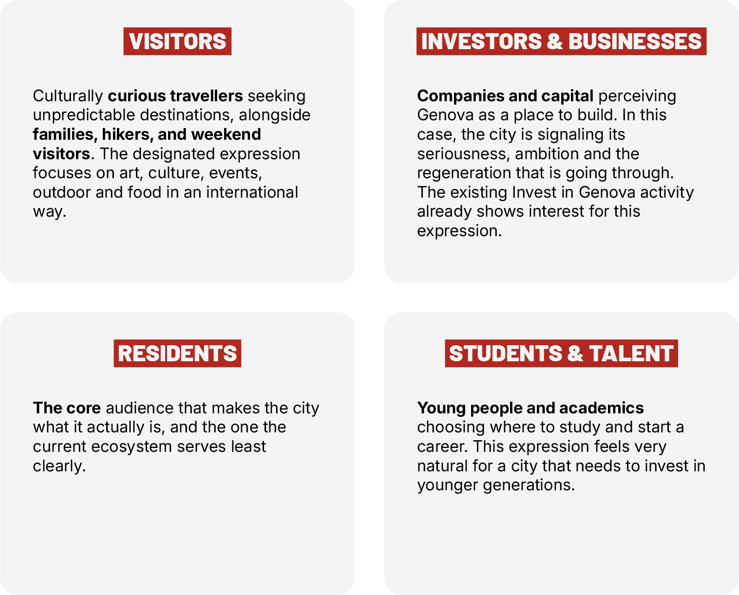
Genova’s voice, just like the city itself, is eclectic and adapt to the audience that is reaching through different expressions. For example, it’s more inviting and warm for the Tourism & Culture, more composed for Business & Investment, more energetic for Study & Talent.
This is a intentional and necessary choice because a city should arrive to everybody, not just a selected target audience.
Brand architecture & target audience
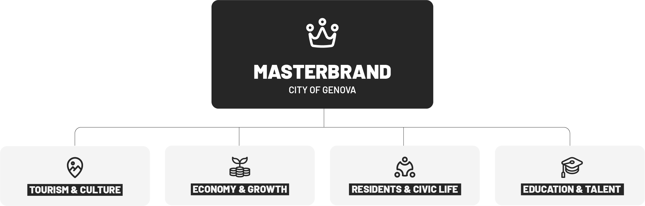
A city masterbrand lives (or dies) on how coherently it flexes throughout audiences and purpose. The masterbrand of Genova stays constant, while each expression opens a different door, sharing the core identity. As the diagnosis showed, Genova already operates the rough shape of this structure over scattered touchpoints. The work of this project is to give those expressions a common system, so they can finally live in one place.
Let’s be honest, though… City brands rarely live under one roof because tourism, investment, education, and civic services are typically run by different departments or even separate organisations with its own voice, audience, budget and touchpoints. This is why I don’t want to force a single rigid mark onto every office. Instead, I put the expressions under the same umbrella of the Genova wordmark and its initial entrance from the official website, but giving them their own little identity and autonomy at the same time. More on that in the next paragraphs.
A note on assumptions: this architecture rests on public research and reasonable assumptions about how Genova’s departments are organised. Here they are openly considered as pure concept’s reasoning.
Audience
Now let’s jump into the visuals…
Shall we?
The Masterbrand
City of Genova
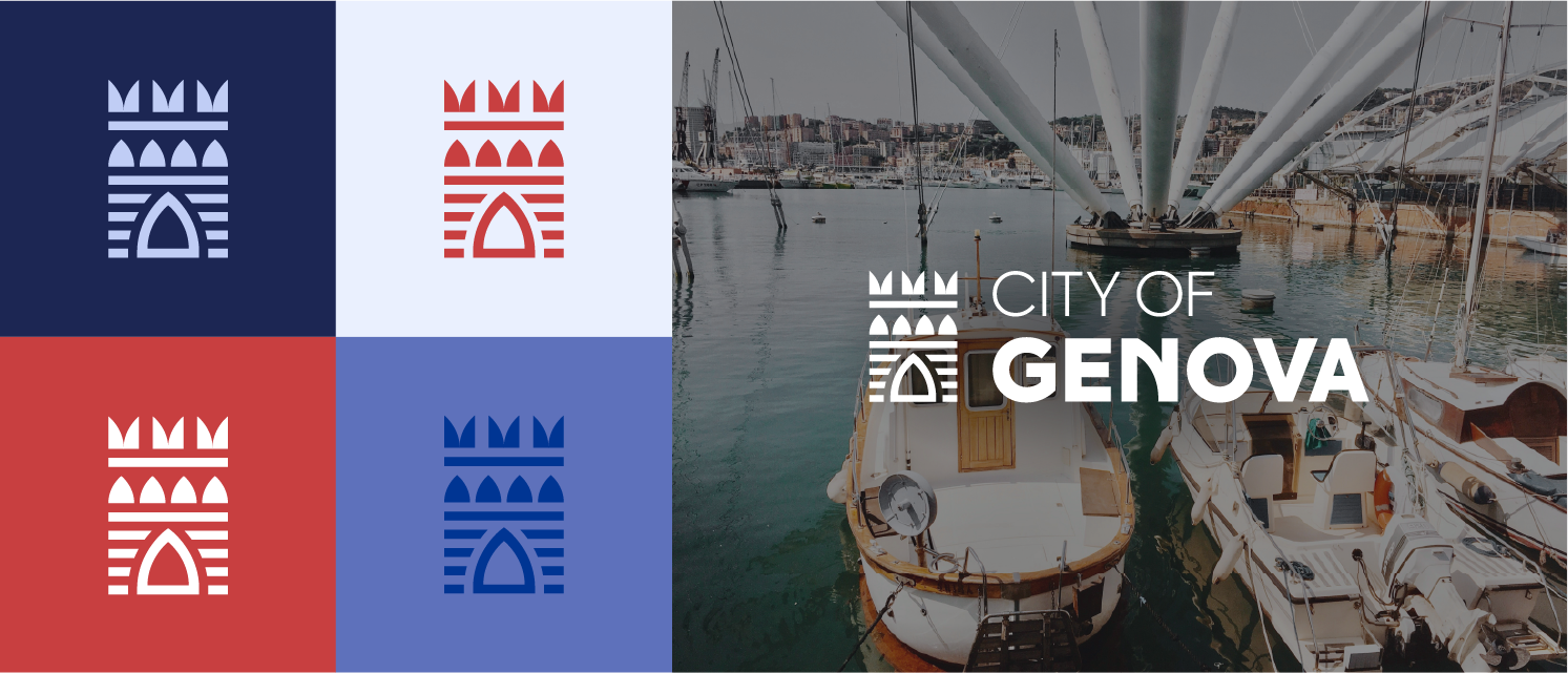
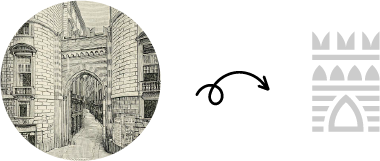
The masterbrand mark comes from Porta dei Vacca, one of the medieval gates into the old city. Choosing a gate was deliberate: a gate is a threshold, a way in, just like the brand itself, which opens its doors to everybody.

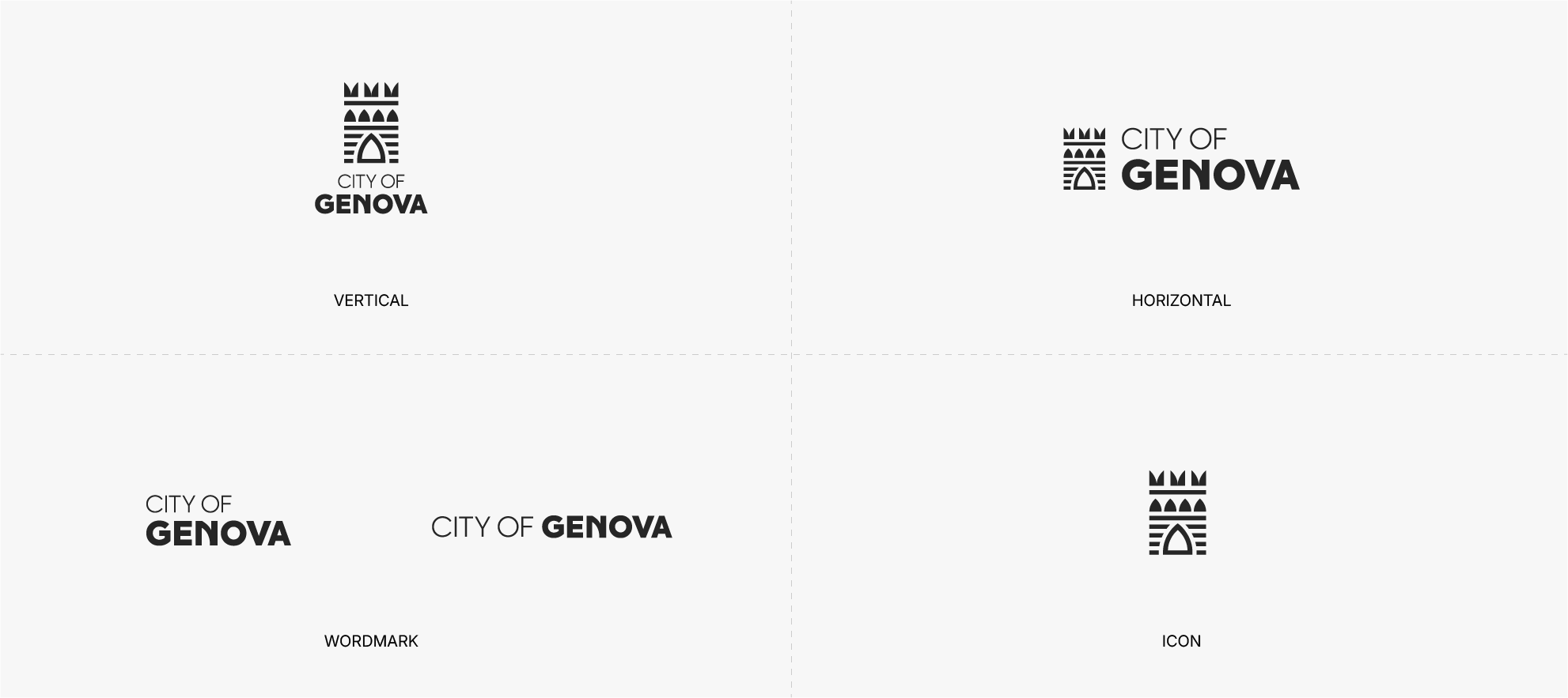
The Axiforma typeface used for the logo was customised in one place only - the letter N, which takes the same curvature as the arch designed for the icon. A small touch, but it pulls the logo together and makes it more genovese.
Master palette
The colour system starts with one master palette build from Genova’s sea, stone, palaces and hills. No expression uses all of the colours. Instead, each one inherits its own palette, starting with one signature shade from the master palette, supported by a handful of tone that suit its audience and purpose.
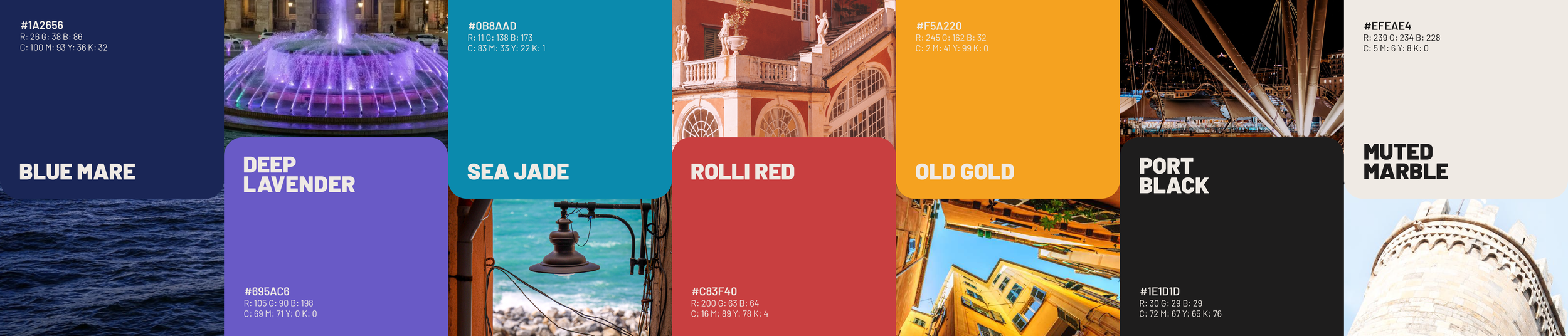
The palette of the City of Genova takes Blue Mare as the primary colour and borrows Rolli Red as an accent - which, spoiler, will be tied to the Visit Genova expression.
The combination made sense not only for that reason, but because it carries cultural meaning rooted in history, seascape and… yes, sport.
City of Genova
- colour palette

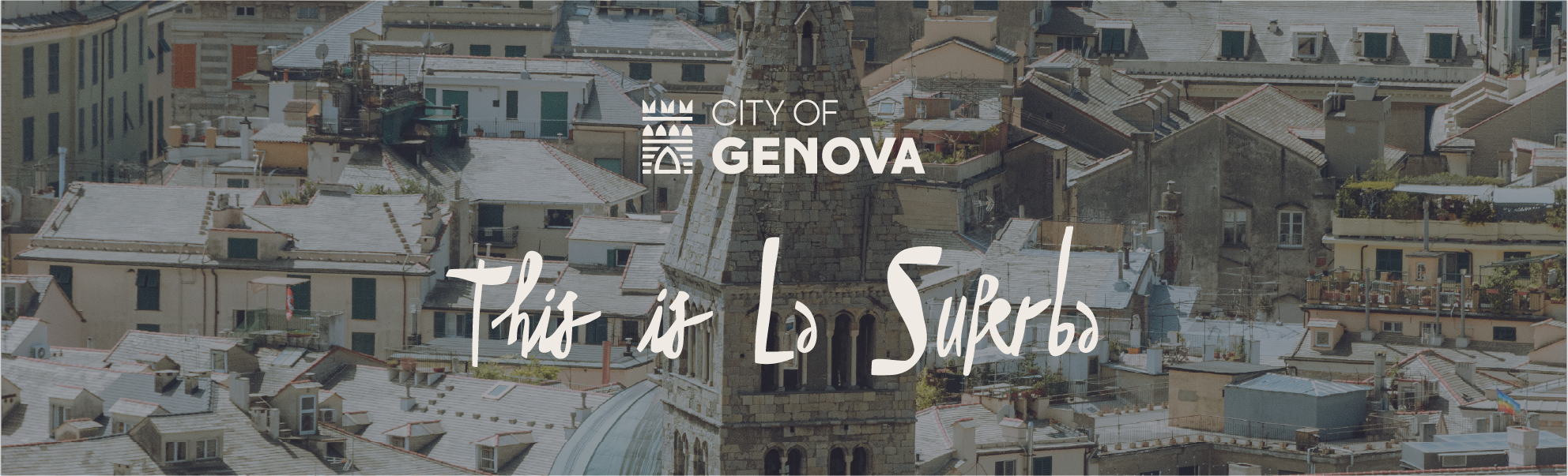
Payoff
In this rebranding, the payoff plays the role of a secondary character, much like the amazing John Leguizamo in many Hollywood movies.
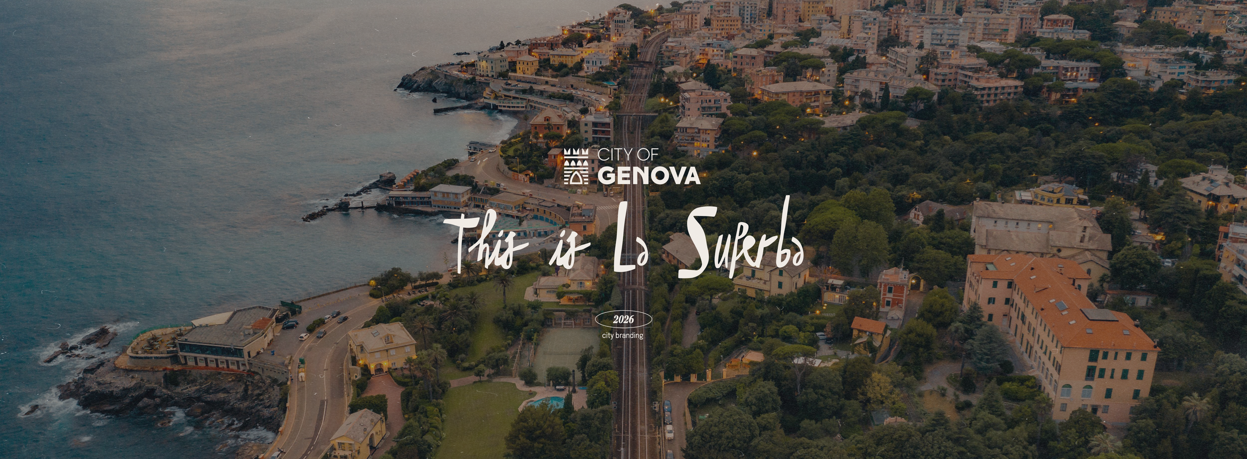
“This is La Superba” is simple, direct to the point and keeps the heritage of Francesco Petrarca, one of the greatest Italian poets, who described the city as superba (”superb” in english). This adjective is still widely used in the community, so it felt very natural and right to bring it into the official branding, and it translates easily back into Italian. Genova is not “more than” anymore. It is the Superba.
The chosen font lands on a very human and handwritten side. When I look at it, I cannot but imagine one of the elder citizens writing it on a piece of paper.
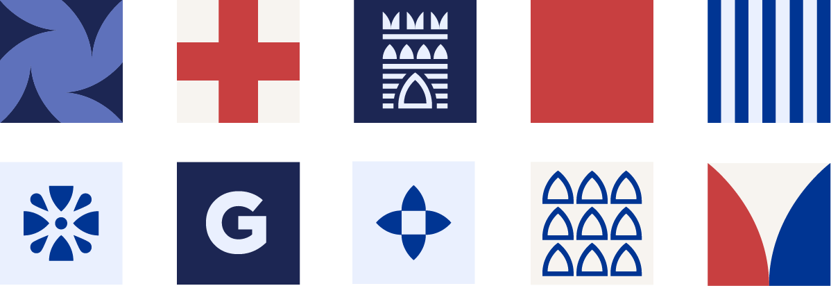
Motifs & applications
The graphic motifs are modular and adaptable to many formats and applications. The colours of each can be swapped and inverted within the chosen palette for each expression.
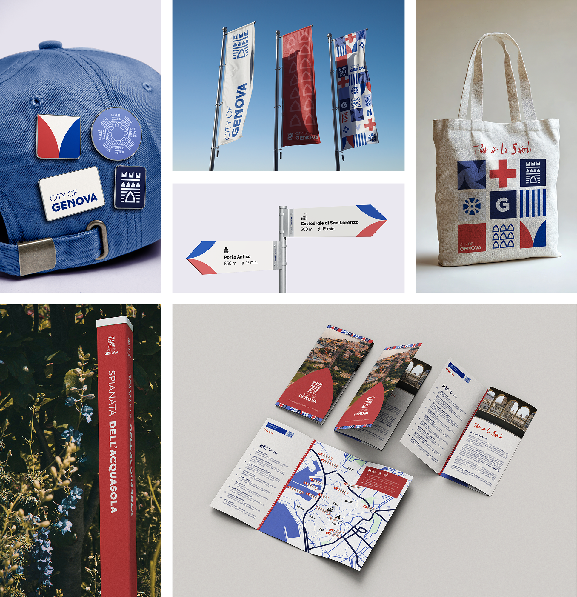
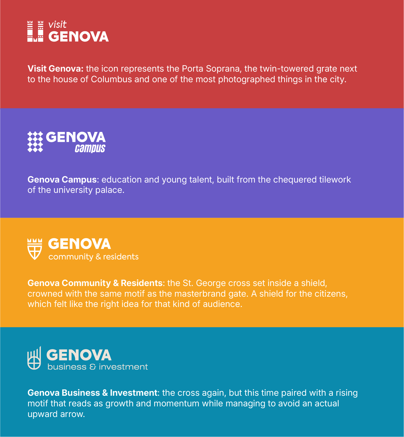
One system, many ways in
Each expression is grounded in its own piece of Genova, the same way the masterbrand is. They keep the same wordmark for consistency and for the shared sense of belonging under one brand umbrella, while each presents a different icon and some variation in the font pairing.
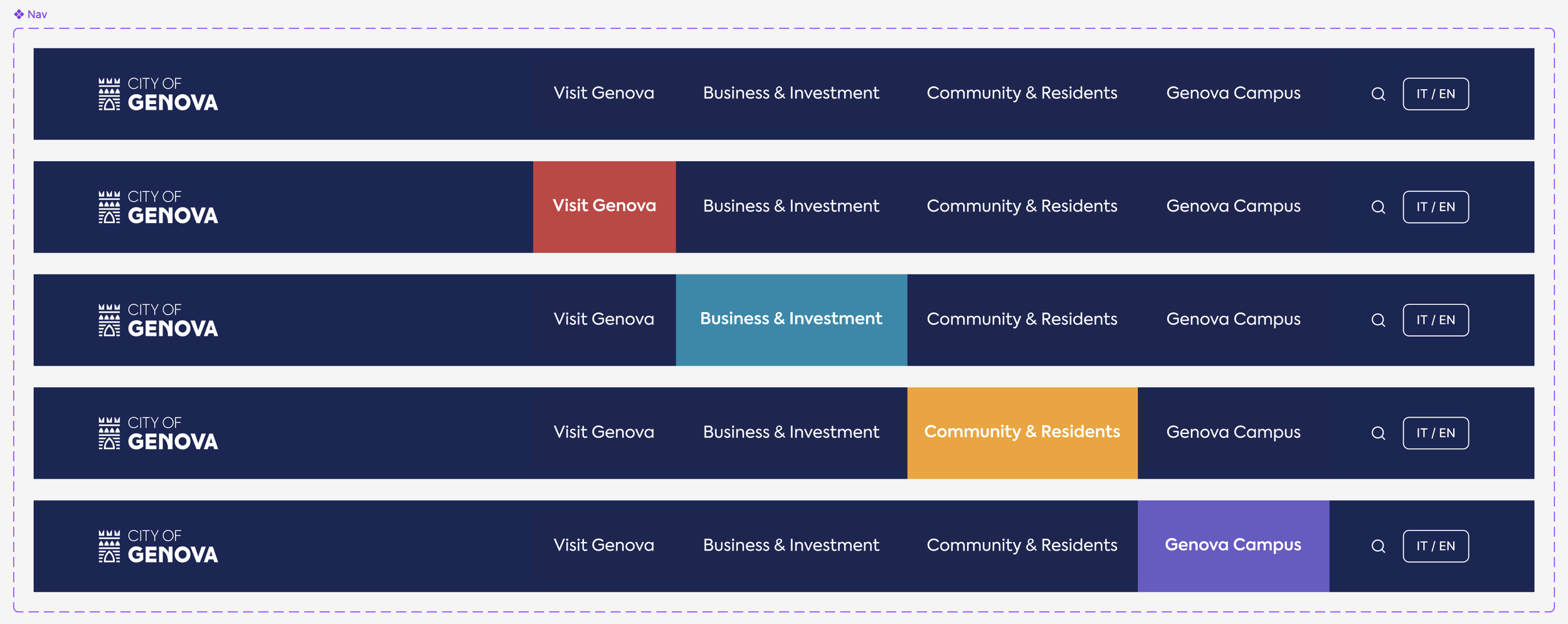
Below: navigation bar concept for the City of Genova webiste.
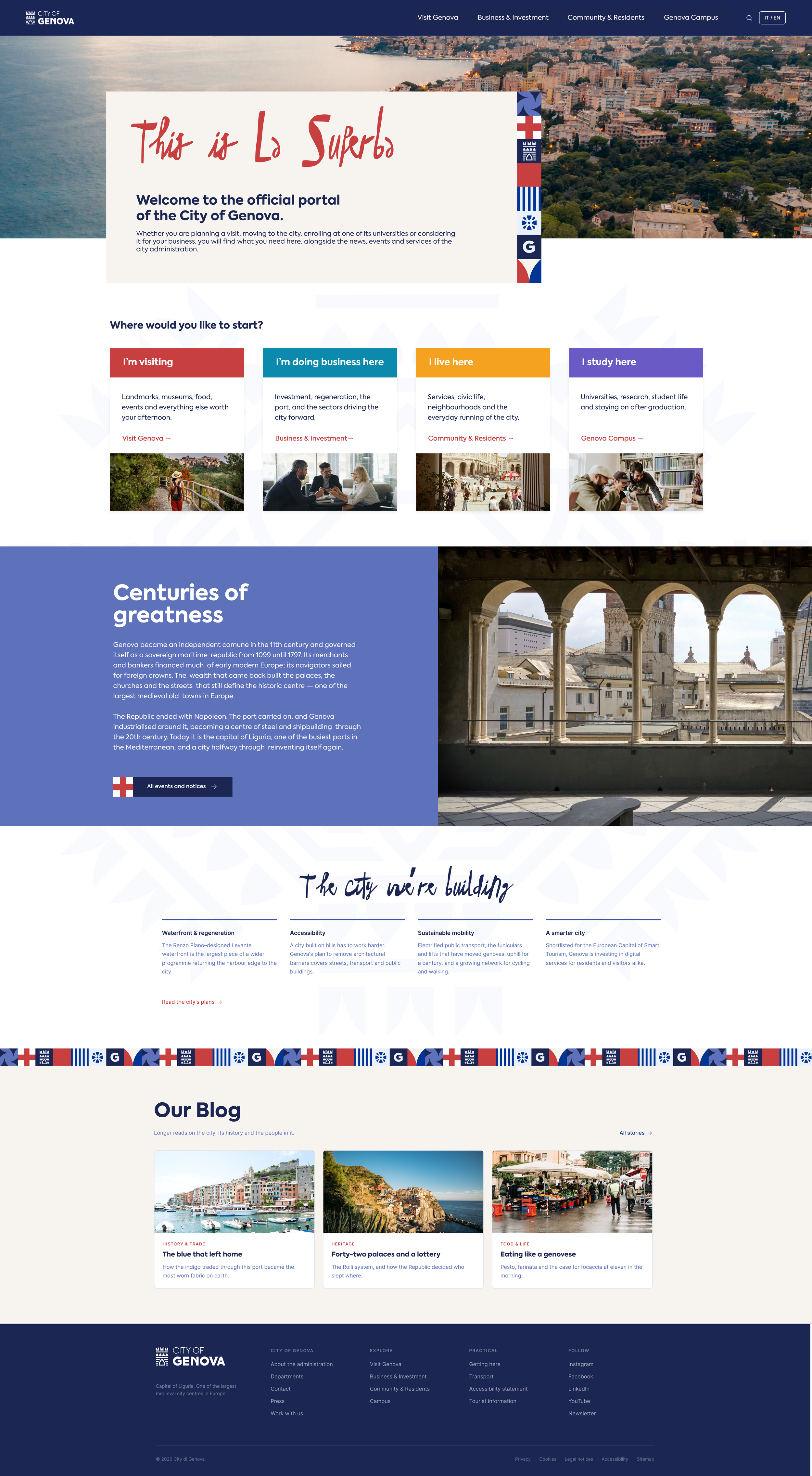
From official to subpages
The journey starts on the official City of Genova website, designed as a hub and starting point for the expressions and thematic subpages, each of which lives in its own environment under a dedicated URL, for example: visit.cityofgenova.com.
The subdomain structure is a premeditated choice. Each expression is run by a different department, with its own content, its own publishing rhytm. Splitting them into multiple domains lets them operate independently and without friction.
To hold this entire estate together, a master design system is required, from which each expression inherits the same foundations - typography, grid, motif, system, master palette - and applies its own accent colour and descriptor on top.
The layout might slightly differ, since it has to adapt to the needs of each subpage and presented topics.
← On the left: a rough concept of the official City of Genova website. It’s not done, it needs refinement and the universal design system application.
Conclusions & final thoughts
Woah, this was a big one. There is still so much to do and expand in this project, but my main goal here was to work on a concept rather than on a humongous amount of deliverables. I’m a firm believer that executing any project is easier than forging an winning idea.
Was this a winning one? Let’s ask a Genovese.